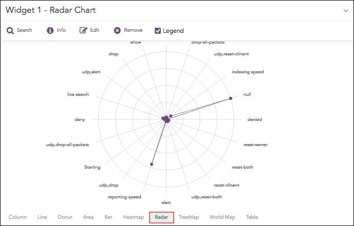
The Radar chart is a graphical representation of multivariate data in the form of a two-dimensional graph, in which one or more quantitative variables are represented on axes starting from the same point.
Each value of grouping parameter(s) forms an individual axis which is arranged radially around a point. These axes are equiangular to each other and known as spoke or radii. Each node depicts the value of a spoke, and the lines are drawn to connect the nodes to each other.
The Radar chart is best for visualizing outliers in a dataset, especially in cases of operation related analysis such as performance metrics and quality improvement. The line between the origin points and radii can be used as the scale for data points.
Radar chart
The following query gives the output shown above.
| chart count by action()
The Radar chart supports four aggregation response types for representation of search results in the visualization. They are:
Response Type |
General Syntax |
|---|---|
| chart aggregation_parameter by grouping_parameter1, grouping_parameter2, ........, grouping_parametern
|
|
| chart aggregation_parameter1, aggregation_parameter2 by grouping_parameter1, grouping_parameter2, ..., grouping_parametern
|
|
| timechart aggregation_parameter
|
|
| timechart aggregation_parameter1, aggregation_parameter2, .... aggregation_parametern
|
Example:
service=* action=* | chart count() by action, service
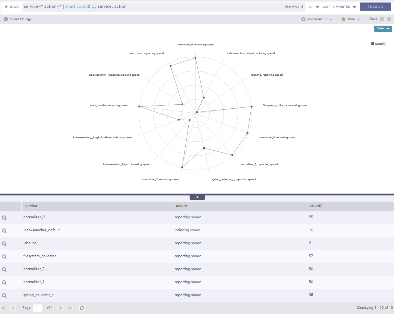
Radar chart for Single Aggregation with Grouping
You can refer to Single Aggregation with Grouping for more details.
Example:
"norm_id"="WinDNSDHCP"| chart count(lease_address=end), count(lease_address=start) by user
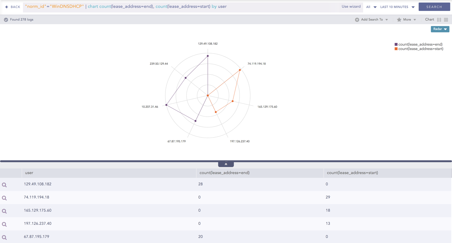
Radar chart for Multiple Aggregation with Grouping
You can refer to Multiple Aggregation with Grouping for more details.
The Radar chart can be used in time queries to graphically represent the change in values of the aggregation parameter over a period.
Example:
"norm_id"="WinDNSDHCP"| timechart count(lease_address=drop)
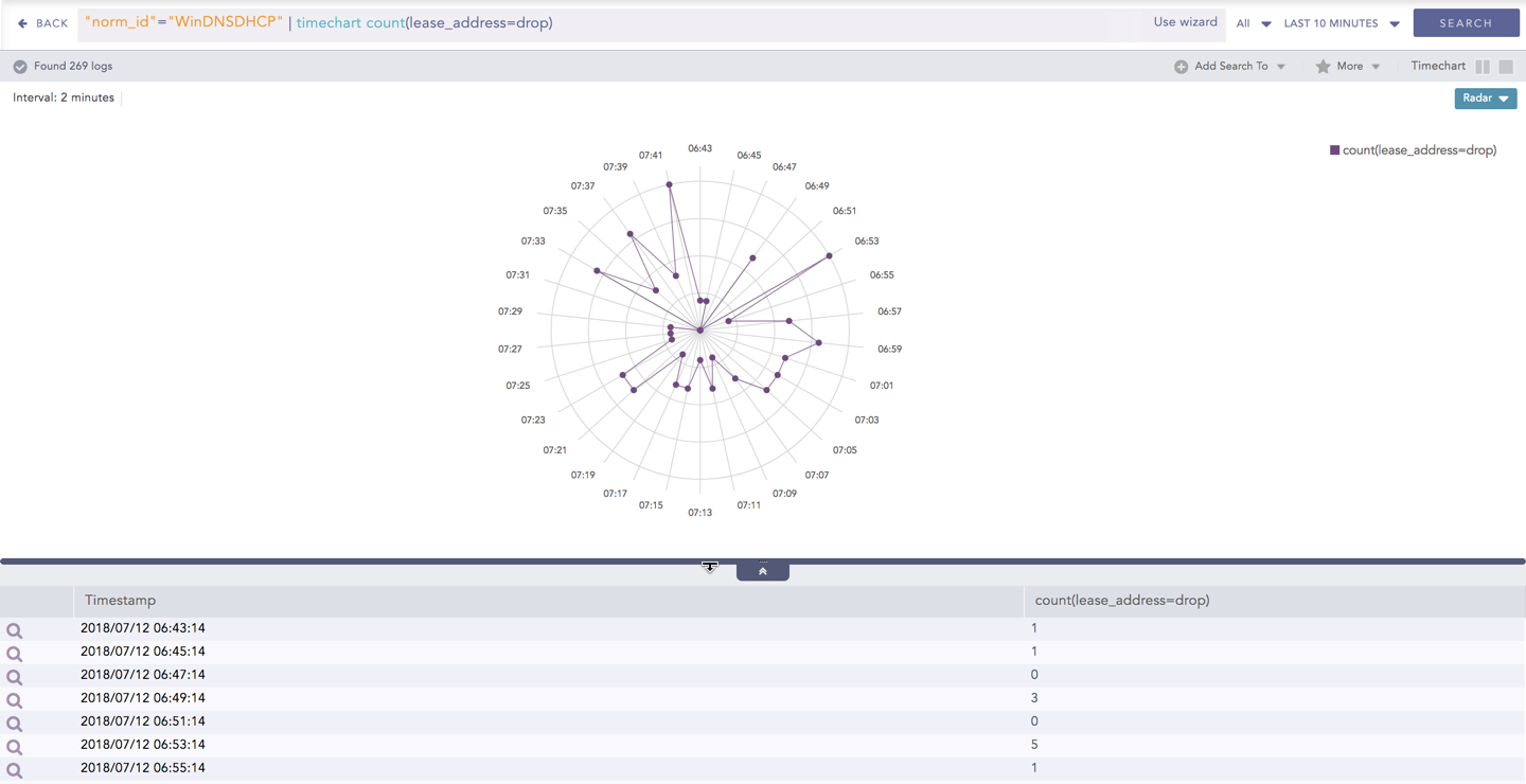
Radar chart - Timechart Single Aggregation without Grouping
You can refer to Timechart Single Aggregation without Grouping for more details.
The Radar chart can be used in time queries to graphically represent the change in values of aggregation over a period. For Timechart Multiple Aggregation without grouping type, each aggregation parameter is represented by a unique color.
Example:
norm_id=WinDNSDHCP | timechart count(lease_address=drop) as Dropped, count(lease_address=start) as Started,
count(lease_address=end) as ENDED
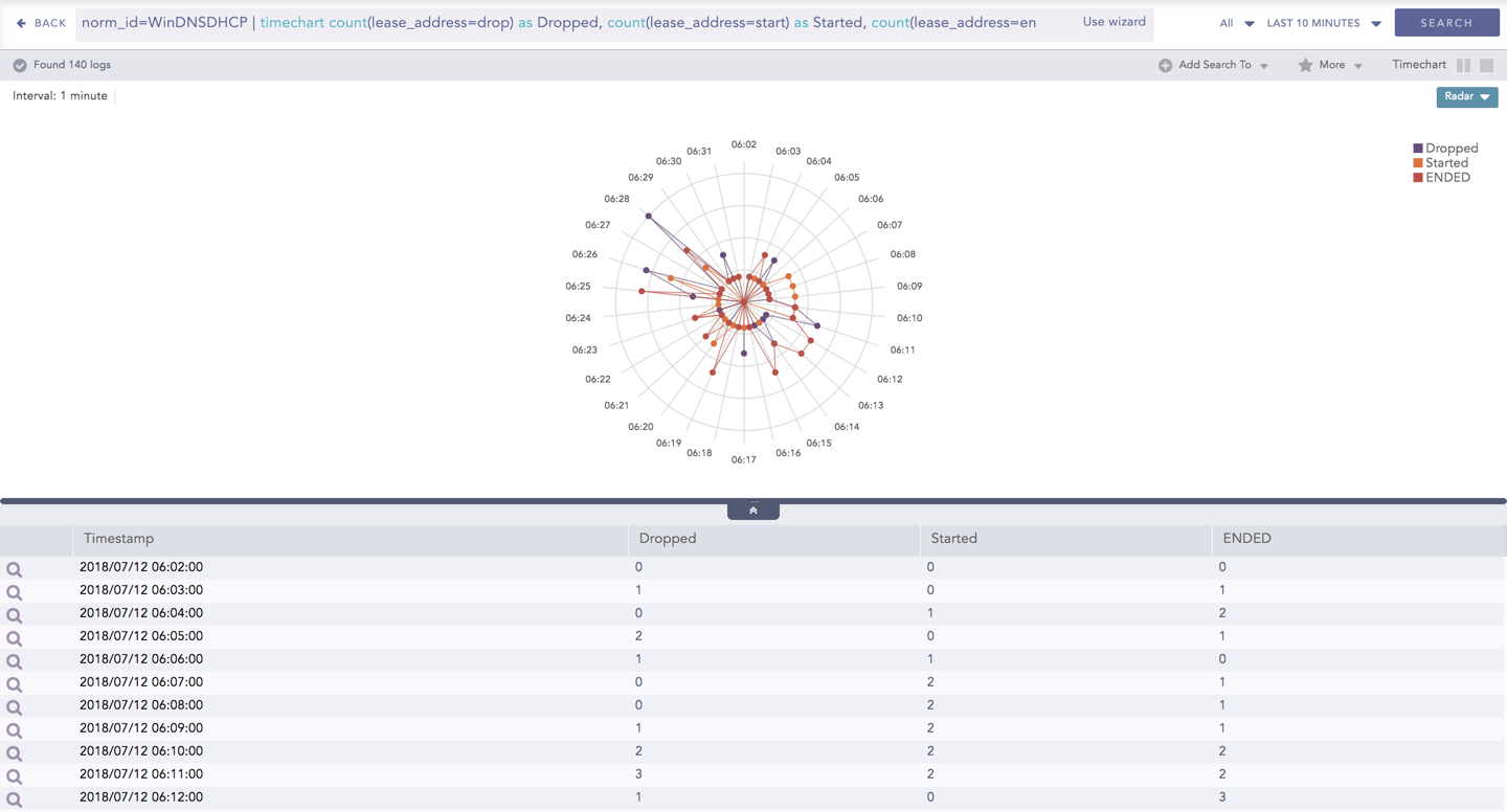
Radar chart - Timechart Multiple Aggregation without Grouping
You can refer to Timechart Multiple Aggregation without Grouping for more details.