A Stacked Column chart uses bars to show the comparisons between categories of data but with an ability to break down and compare parts of a whole. Each bar in the chart represents a whole, and segments in the bar represent different parts or categories of that whole.
Similar to the Clustered Line Chart, the y-axis represents value of the aggregation parameter, and the x-axis displays value of the timestamps.
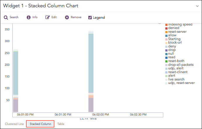
Stacked Column Chart
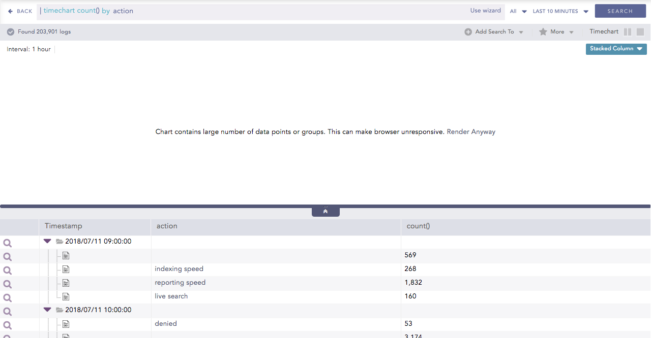
The following query gives the output shown above.
| timechart count() by action
You can use this chart to display the following response type:
The Stacked Column chart supports a single aggregation response type for representation of search results in the visualization. They are:
Response Type |
General Syntax |
|---|---|
| timechart aggregation_parameter by grouping_parameter1, grouping_parameter2, ....., grouping_parametern
|
Example:
source_address=* | timechart count() by source_address
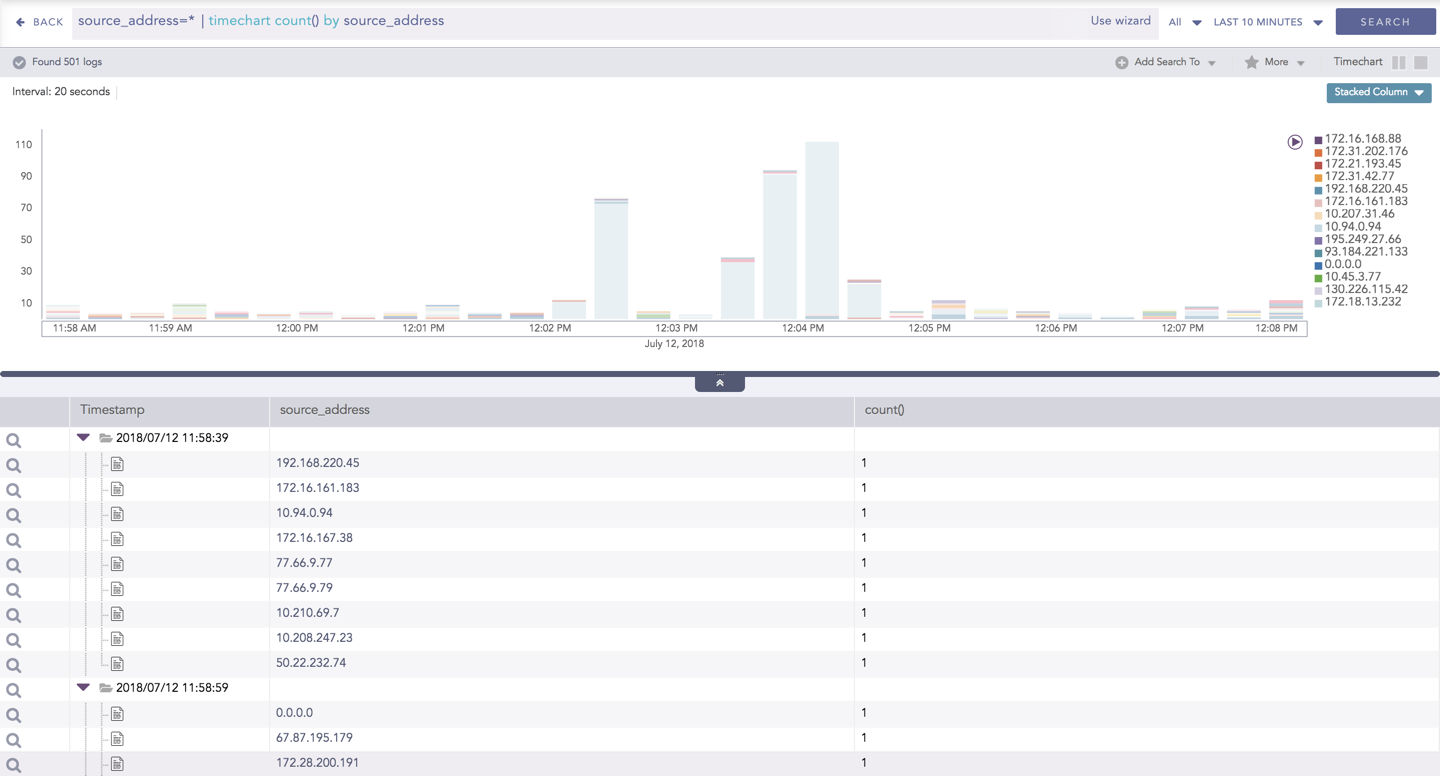
Stacked Column for Timechart Single Aggregation with Grouping
Note
If the search result contains a large number of data points (more than 50) or groups (more than 20), switching from the Clustered Line to Stacked Column consumes a large amount of CPU resources. In this case, LogPoint displays the following message.
You can refer to Timechart Single Aggregation with Grouping for more details.