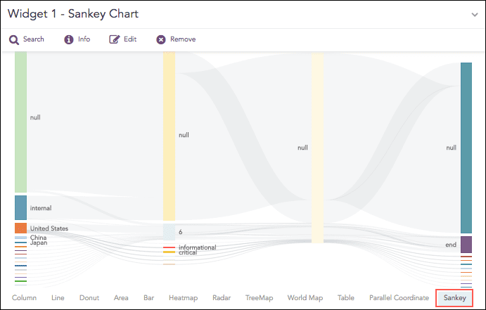
Sankey chart is a flow diagram used to depict a flow from one set of values to another. The connected values are called nodes and the connections are called links. It displays the corresponding grouping parameters on top of each node of the chart. The width of the link shows the magnitude of the flow. Colors are used to divide the diagram into different nodes or to show the transition from one state of the process to another.
Use the Sankey chart to show a many to many mapping between two or more nodes. The aggregation parameter is used to define the width of the flow between a source node and the destination node.
Example:
| process geoip(source_address) as country | chart count() by country, severity, category, sub_category
Sankey chart
The Sankey chart supports a single aggregation response types for representation of search results in the visualization. It is :
Response Type |
General Syntax |
|---|---|
| chart aggregation_parameter by grouping_parameter1, grouping_parameter2, ........, grouping_parametern
|
Example:
| process geoip(source_address) as country | chart count() by country, severity, category, sub_category
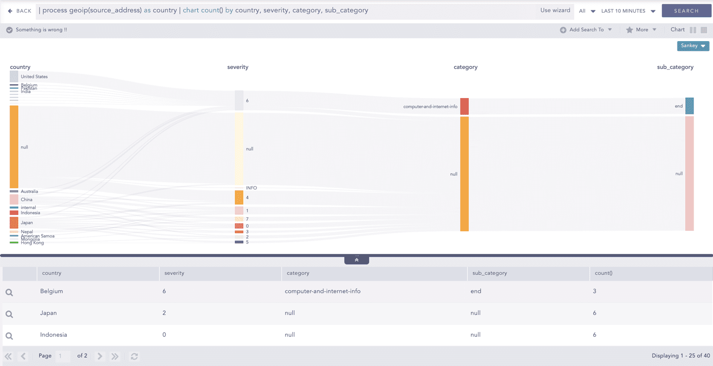
Sankey chart for Single Aggregation with Grouping
You can refer to Single Aggregation with Grouping for more details.