The Bubble Chart is a scatter chart that shows the relationship between variables using three dimensions: the x-axis, the y-axis, and the bubble radius. The chart can display different groups of data at once. Based on the grouping parameter, the chart groups the data into bubbles of different colors with each color representing a single group.
You can see the group names and their corresponding colors in the legend to the right of the chart.
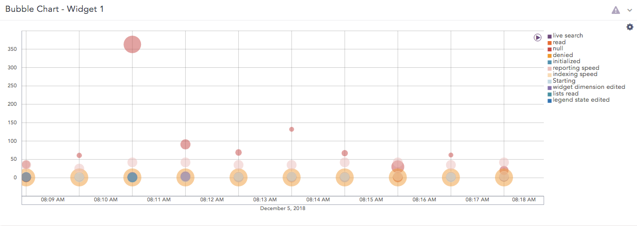
Bubble chart
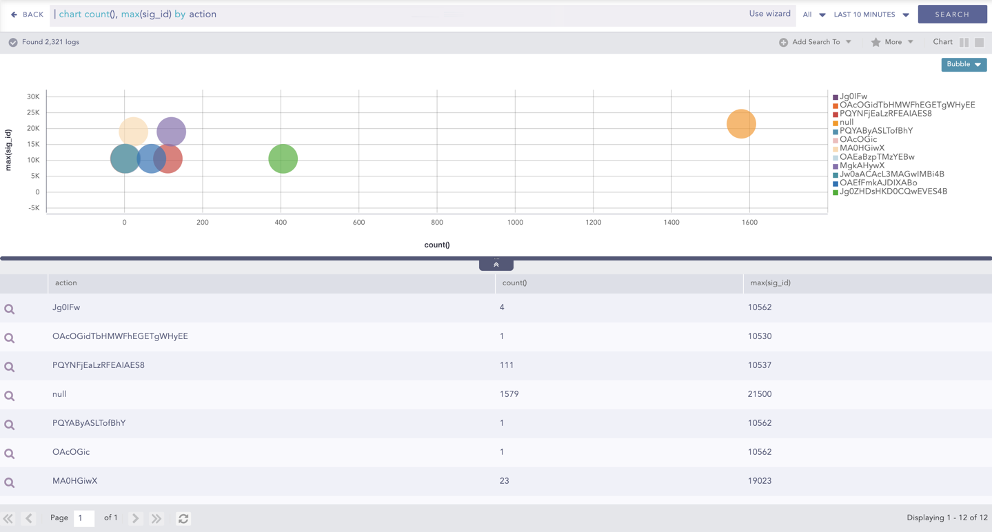
The following query gives the output shown above.
timechart count(), avg(sig_id) by action
The Bubble chart supports two aggregation response types for representation of search results in the visualization. They are:
Response Type |
General Syntax |
|---|---|
| chart aggregation_parameter1, aggregation_parameter2 by grouping_parameter1, grouping_parameter2, ...,grouping_parametern
|
|
| timechart aggregation_parameter1, aggregation_parameter2, ...., aggregation_parametern by grouping_parameter1, grouping_parameter2, ...., grouping_parametern
|
Example:
| chart count(), max(sig_id) by action
Bubble Chart - Multiple Aggregation with Grouping
By default, in the search command for the Bubble Chart, the first aggregation parameter represents the x-axis while the next two parameters represent the y-axis and the bubble radius respectively.
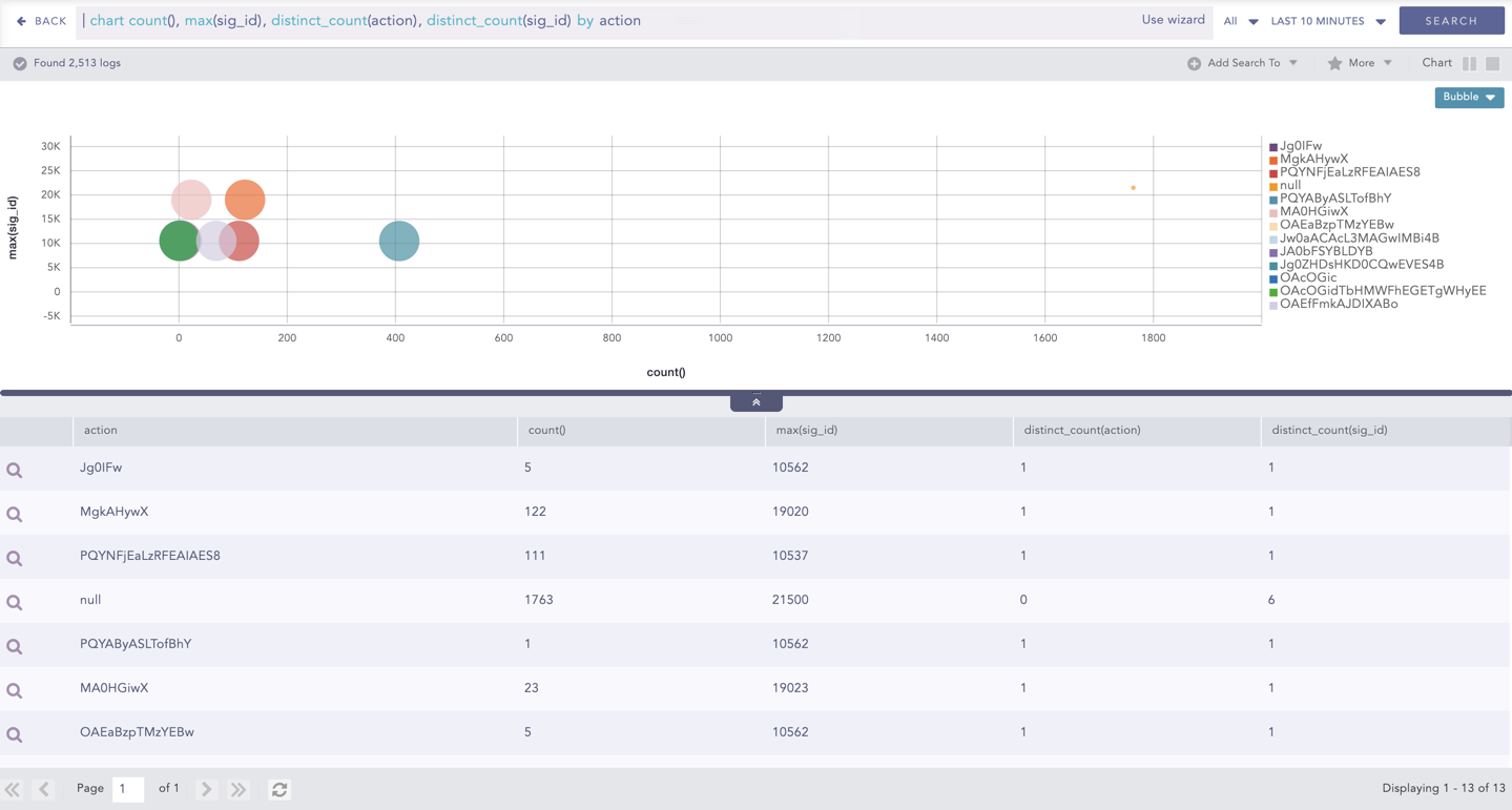
You can also use the Bubble Chart with more than three aggregation parameters. To see the values of the other parameters, hover over a bubble in the chart. A tooltip appears, displaying all the values of the parameters associated with the bubble chart.
Note
The radii with negative values are represented in the red-colored text. However, the system takes the modulus of the negative value and plots it in the chart.
Example:
| chart count(), max(sig_id), distinct_count(action), distinct_count(sig_id) by action
Bubble Chart with Four Aggregation Parameters and One Grouping Parameter
You can refer to Multiple Aggregation with Grouping for more details.
Example:
| timechart count(), avg(sig_id) by status_code
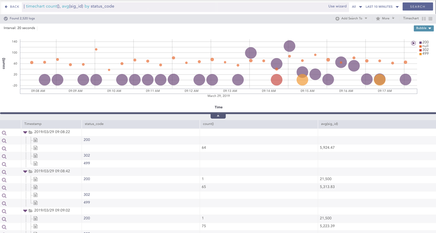
Bubble Chart - Timechart Multiple Aggregation with Grouping
By default, in the search command for the Bubble Chart, the timechart represents the Time paramter in the x-axis while the next two parameters represent the y-axis and the bubble radius respectively.
You can also use the Bubble Chart with more than three aggregation parameters. To see the values of the other parameters, hover over a bubble in the chart. A tooltip appears, displaying all the values of the parameters associated with the bubble.
Note
The radii with negative values are represented in the red-colored text. However, the system takes the modulus of the negative value and plots it in the chart.
Example:
| timechart count(), avg(sig_id), max(datasize), distinct_count(sig_id) by status_code
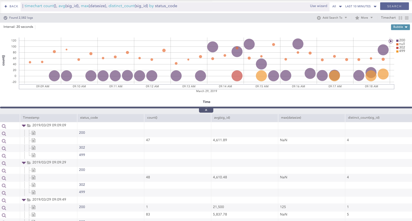
Bubble Chart with Four Aggregation Parameters and One Grouping Parameter
You can refer to Timechart Multiple Aggregation with Grouping for more details.
Click the settings icon at the top-right corner of the Bubble Chart to open a dialog box. The dialog box allows you to configure the rendering parameters of the Bubble Chart.
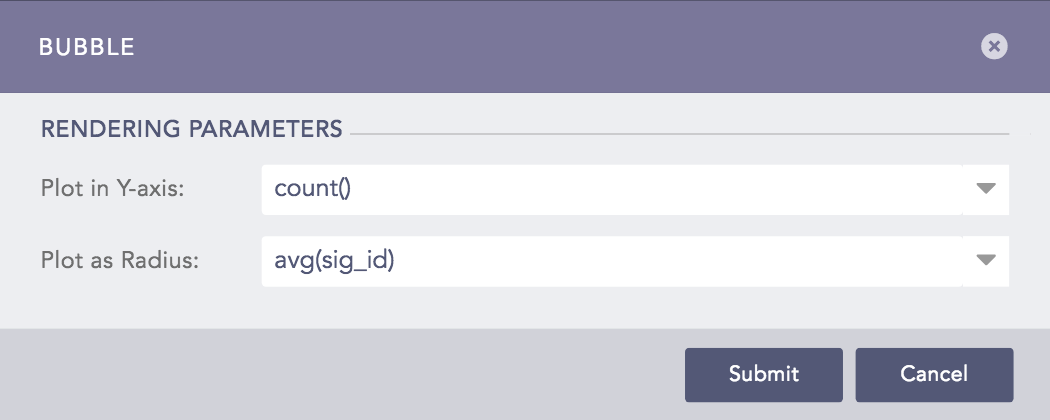
Rendering Parameters of Bubble Chart
You can select the required parameters from the Plot in Y-axis and Plot in Radius drop-down menus to represent the y-axis and the bubble radius respectively.
Note
Make sure you select different parameters to represent the y-axis and the bubble radius.