The Clustered Bar chart is a horizontal bar graph that represents multiple categorical data in a rectangular bar with the width proportional to the value.
The only difference between a Clustered Bar chart and a Clustered Column Chart is the placement of parameters. In a Clustered Column Chart, the aggregation parameter is placed on the x-axis whereas, in a Clustered Bar chart, the parameters are placed in the y-axis.
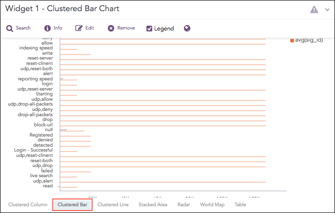
Clustered Bar Chart
The following query gives the output shown above.
| chart count(), avg(sig_id) by action
The Clustered Bar chart supports two aggregation response types for representation of search results in the visualization. They are:
Response Type |
General Syntax |
|---|---|
| chart count(), avg(datasize)
|
|
| chart aggregation_parameter1, aggregation_parameter2 by grouping_parameter1, grouping_parameter2, ..., grouping_parametern
|
Example:
| chart avg(sent_datasize), avg(received_datasize)
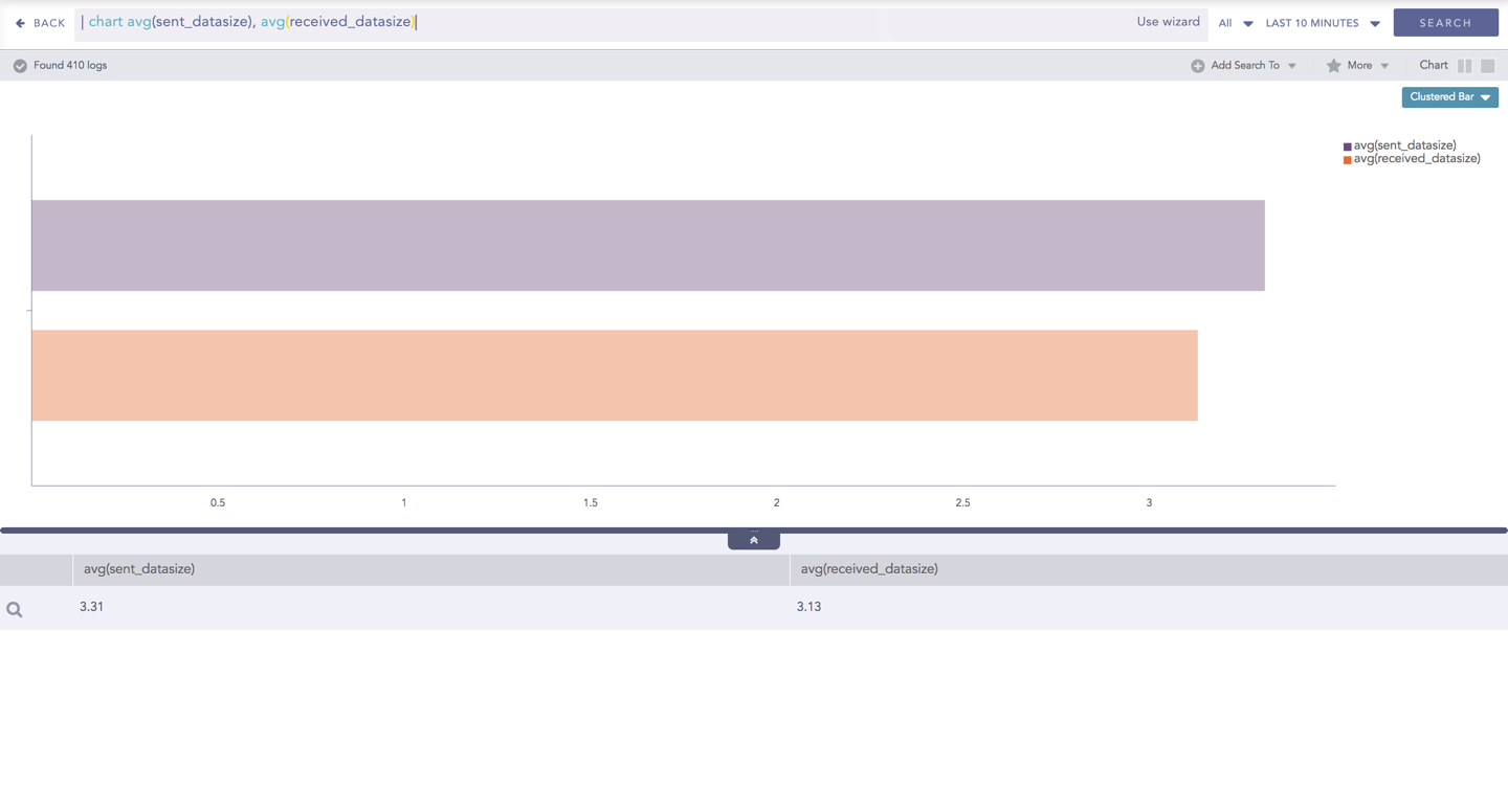
Clustered Bar chart for Multiple Aggregation without Grouping
You can refer to Multiple Aggregation without Grouping for more details.
Example:
action=Allow or action=Deny | chart count(action=allow) as AllowedConnection, count(action=
deny) as DeniedConnection by source_address order by count(action=allow), count(action=
deny) desc limit 10
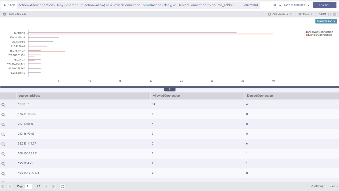
Clustered Bar chart for Multiple Aggregation with Grouping
You can refer to Multiple Aggregation with Grouping for more details.