Matrix of Anomalies displays either a scatter chart or a column chart that visualizes the anomalies from the logs analyzed by Logpoint UEBA. You can view the matrix of anomalies for each entity from their tab in the UEBA page. You can view the individual entity tab only if there are any anomalies for the entity.
To switch between scatter chart, column chart, and no chart, click the icons at the top-right of the Users tab.
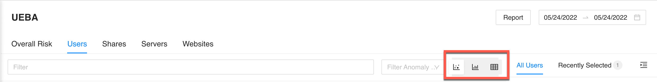
Chart Selection
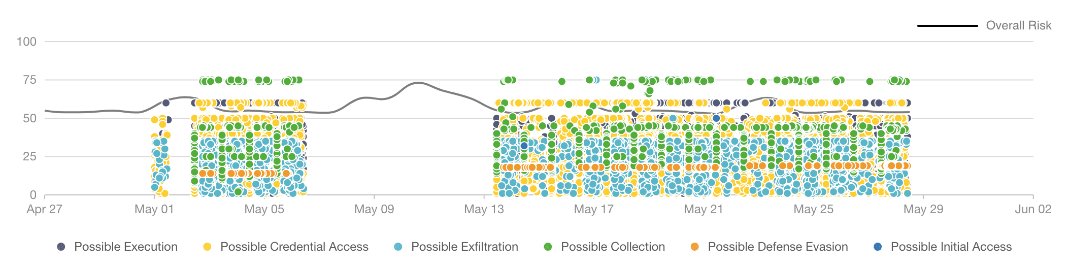
Overall Risk Trend in the Matrix of Anomalies Scatter Chart
This chart includes the overall risk trend and the entity risk trend. The entity risk trendline is based on the latest entity selected. You can view the risk trendline for each entity by selecting at least one day from the date-range. This chart displays time-range along the X-axis and Risk Scores along the Y-axis. Additionally, they show multiple points color-coded by their threat type. Each point indicates that one anomaly is present.
The chart legend lists all the threat types associated with the entity. By default, all the threat types are selected. You can deselect threat types to remove the anomalies associated with them from the chart by clicking on the threat specific legends at the bottom of the chart.
If you hover over the chart on any scatter point, it displays entity name, anomaly risk score, threat type, anomaly risk category, and entity risk score.
You can zoom in on a specific time-range or anomaly risk score by dragging the ( ) scatter brush on the chart. Once you select a range, the anomalies list shows anomalies from the selected range only. You can reset the chart by clicking the Reset button.
The Scatter chart has a limit of 30000 anomalies.
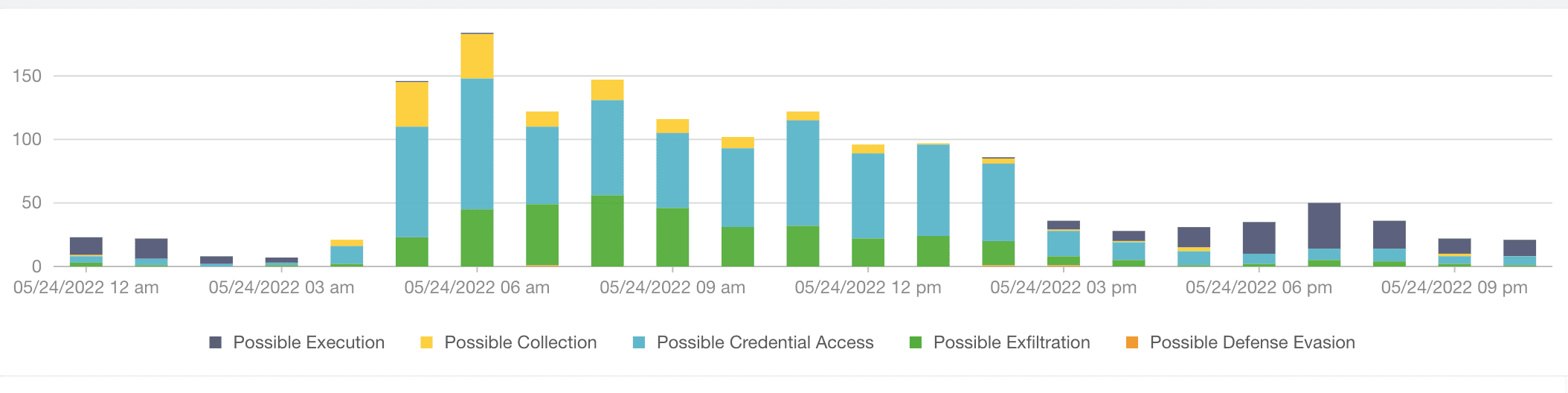
Overall Risk Trend in the Matrix of Anomalies Column Chart
Column chart simultaneously monitors both the overall count of anomalies and the individual sub-categories within it. This chart displays time-range along the X-axis and anomaly count along the Y-axis. Each column in the chart represents the overall count of anomalies at the mentioned time and the count of anomalies according to their threat type, which is color coded. The overall anomaly count is broken down into subcategories like Possible Execution, Possible Collection, Possible Credential Access, Possible Exfiltration, and Possible Defense Evasion.
By default, all the threat type subcategories are selected. You can deselect threat types to remove the anomalies associated with them from the chart by clicking on the threat specific legends at the bottom of the chart.
If you hover over a column, it displays a breakdown of each threat type during the time period with their cumulative score.