Search Results Visualization
Visualizations define how search results are presented in dashboards and search views. They transform raw log data into charts and tables that help you quickly identify trends, patterns, and anomalies.
Logpoint visualizations support different response types, aggregation methods, and time-based grouping, allowing you to tailor how data is displayed based on your analysis needs. You can group results into time buckets for a selected time range, apply filters, and switch between visualization types to explore data from multiple perspectives.
Visualizations are interactive and support actions such as drilldown, enabling you to move from high-level visual summaries to detailed search results for further investigation.
Use visualizations to:
Analyze large volumes of log data efficiently
Compare values across time or categories
Monitor trends and deviations
Support investigation workflows directly from dashboards
Response Types in Visualization
There are eight response types used to visualize search results. Four are standard response types, while the other four group the same responses into time buckets based on the selected time range.
Single Aggregation without Grouping
The Single Aggregation without Grouping response type is used for the aggregation of an individual parameter concerning a given aggregation parameter.
The general syntax for the Single Aggregation without Grouping is:
| chart aggregation_parameterThis search query displays the value of the aggregation parameter over a specified range of time. The result of this response type can be represented in the form of :
Single Aggregation with Grouping
The Single Aggregation with Grouping response type aggregates grouping parameters for a given aggregation parameter. The general syntax for Single Aggregation with Grouping is:
Example queries of Single Aggregation with Grouping are:
The response type displays the value of the aggregation parameter, grouped by all the grouping parameter(s) in the specified time range. The result of this query can be represented in the form of :
General Operations for Single Aggregation with Grouping
This section contains the general operations applicable to all charts in the Single Aggregation with Grouping response type.
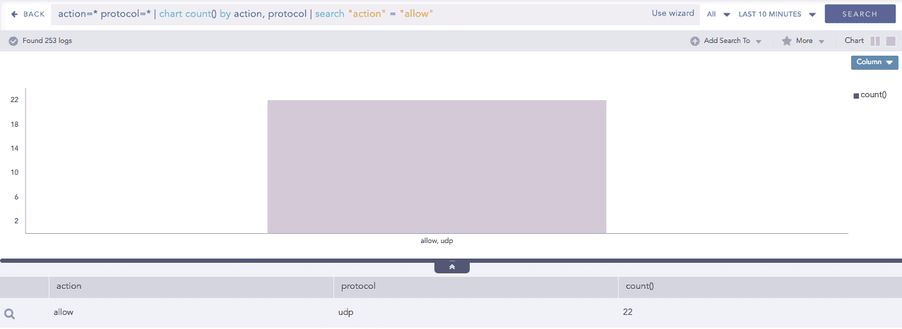
Drill-down
In the Single Aggregation with Grouping response type, drill down to the specific value of the grouping or aggregation parameter.
When you hover over a component of a graph (including but not limited node, line, bar, point) a tooltip appears. The tooltip displays all the relevant information about the particular component.
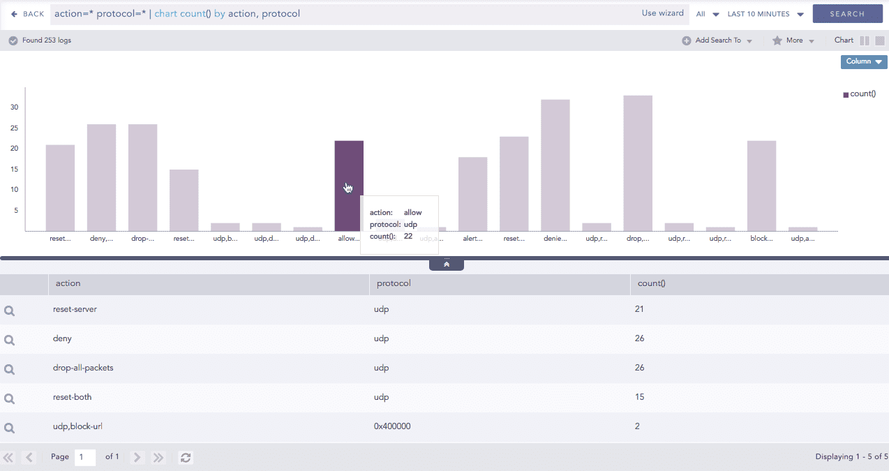
Click the component to open a new drill-down window. The window summarizes the selected node's information and includes an option to drill down as needed.
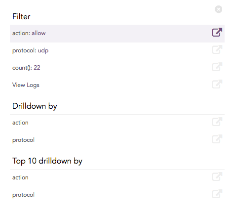
Click the corresponding Open in a new window icon to further drill down on any field. Additionally, view the search results for the selected set of data by clicking View Logs in the same window.
Multiple Aggregation without Grouping
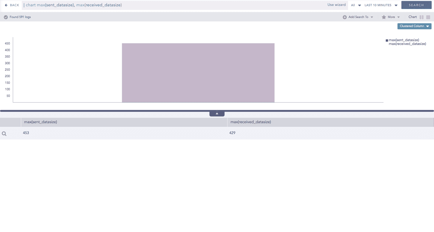
The Multiple Aggregation without Grouping response type is used for aggregation of multiple aggregation parameters for all the available logs or the given repo and time range. An example of a search query for such response is:
This query displays the total count and the average of datasize of the logs collected in the specified range of time. The result of this query can be represented in the form of :
General Operations for Multiple Aggregation without Grouping
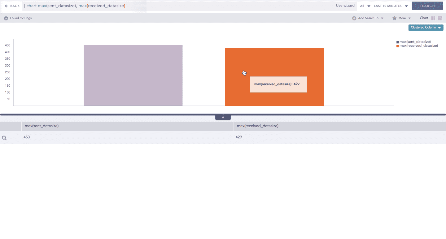
Interactive Legend
In Multiple Aggregation without Grouping, when a chart is rendered, all selected aggregation parameters are displayed with a unique color for each aggregation parameter. However, you can choose to view the graphs concerning a specific aggregation parameter(s).
To hide an aggregation parameter, click the name of the parameter on the legend at the extreme right side of the container.
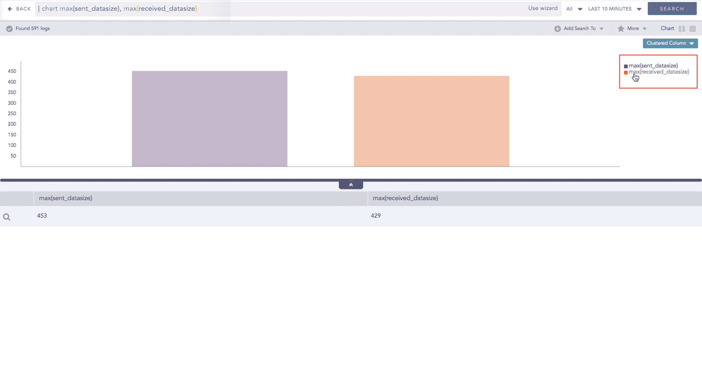
When you click a name of a parameter on the legend, the section referring to the respective parameter disappears, and a new chart is rendered consisting of all other aggregation parameters. You can unhide the parameter by clicking the legend again.
The scale on the y-axis is auto-adjusted as per the value of the remaining aggregation parameter(s).
Drill down
Through the drill-down feature, you can choose to retrieve detailed results about a specific section of a chart. In Multiple Aggregation without Grouping response type, you can drill-down search operation over a specific value of aggregation parameter.
Hover over a component of a graph (example: node, line, bar, point) to view the tooltip. The tooltip displays all the relevant information about the particular component.
Click the segment to open a drill-down window. The window summarizes the related information of the selected section along with the option to drill down as per your preference.
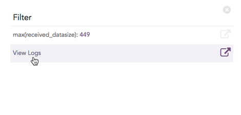
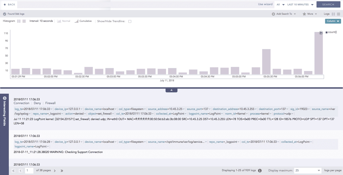
Click the corresponding Open in a new window icon to further drill-down the search result from any field. Additionally, click the View Logs to view the search result for the selected set of data.
The drill-down feature is not applicable for the Display format of Multiple Aggregations without Grouping response type.
Multiple Aggregation with Grouping
The Multiple Aggregation with Grouping response type is used for aggregation of grouping parameters concerning given multiple aggregation parameters.
The general syntax for Multiple Aggregation with Grouping is:
Example queries of Multiple Aggregation with Grouping type are:
This query displays the count and average datasize of the collected logs in the specified time range grouped by the actions applied. The result of this query can be represented in the form of:
Visualization Type
Sample Search Query
General Operations for Multiple Aggregation with Grouping
This section contains the general operations that can be applied to all the charts belonging to the Multiple Aggregation with Grouping response type.
Some charts might consist of operations that are relevant to the specific chart only. For such operations, refer to the section of the particular chart.
Interactive Legend
In the Multiple Aggregation with Grouping response type, when a chart is rendered, values of all the selected aggregation parameters are displayed with a unique color for each aggregation parameter. However, you can choose to view the graphs concerning specific aggregation parameter(s).
To hide an aggregation parameter, click the name of the parameter on the legend at the extreme right side of the container.
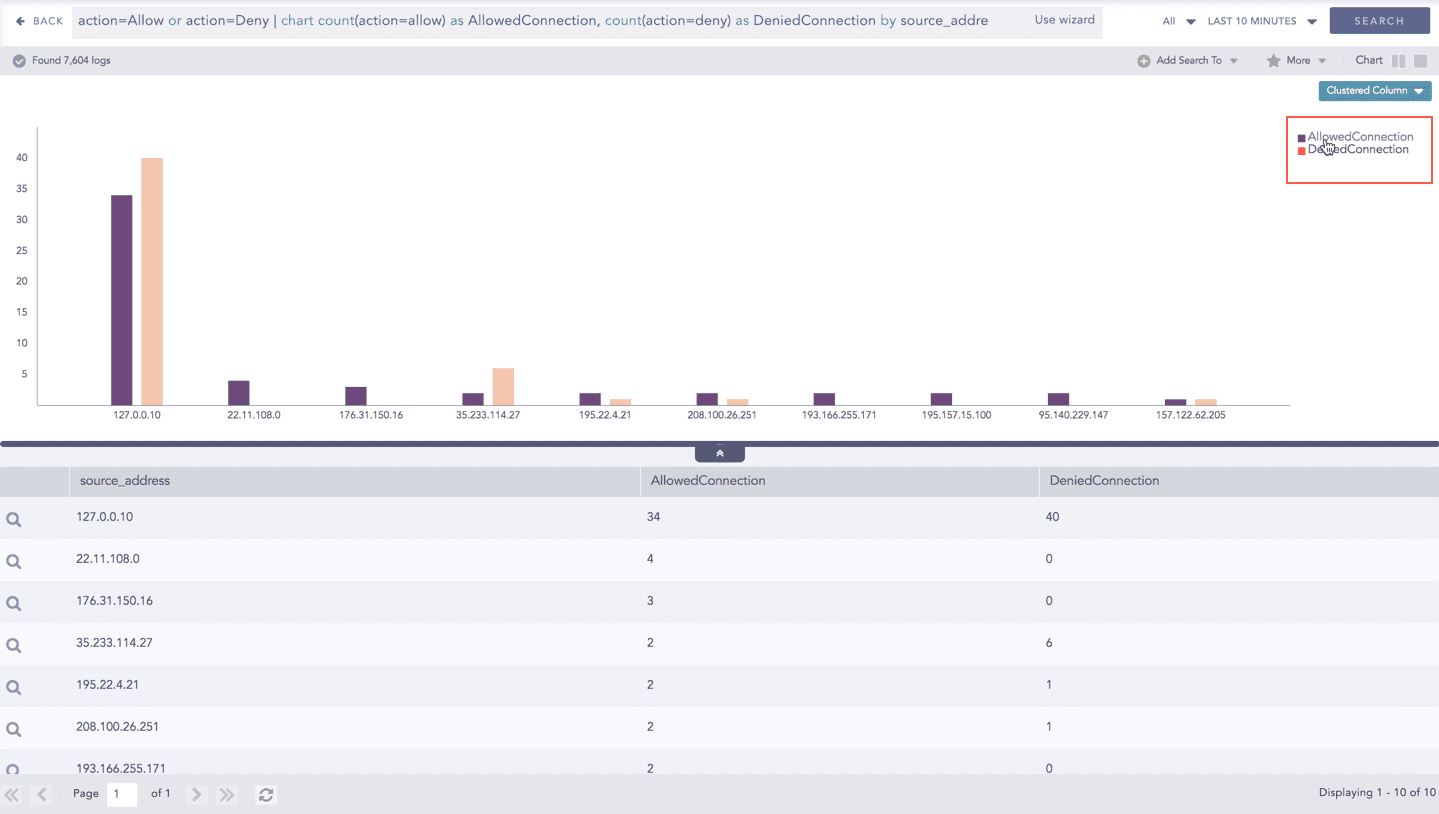
Click the name of a parameter on the legend, to hide its respective section. A new chart is rendered consisting of all other aggregation parameters. You can unhide the parameter by clicking the legend again.

The scale on the y-axis is auto-adjusted as per value of the remaining aggregation parameter(s).
Drill-down
In the Multiple Aggregation with Grouping response type, you can drill-down search operation regarding a specific value of the grouping parameter concerning a single or multiple aggregation parameters.
Hover over a component of a graph (example: node, line, bar, point e.t.c) to view a tooltip. The tooltip displays all the relevant information about the particular component.
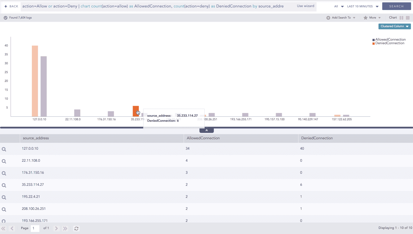
Click the segment to open a drill-down window. The window summarizes the related information of the selected section along with the option to drill down as per your preference.
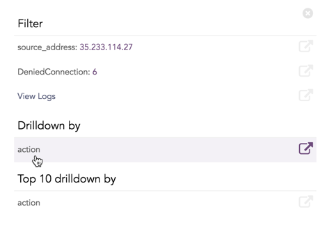
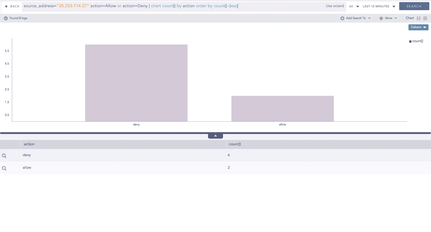
Click the corresponding Open in a new window icon to further drill-down the search result from any field. Additionally, click the View Logs to view the search result for the selected set of data.
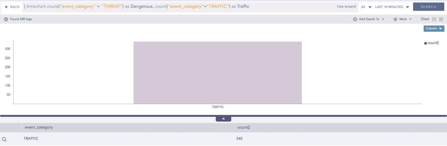
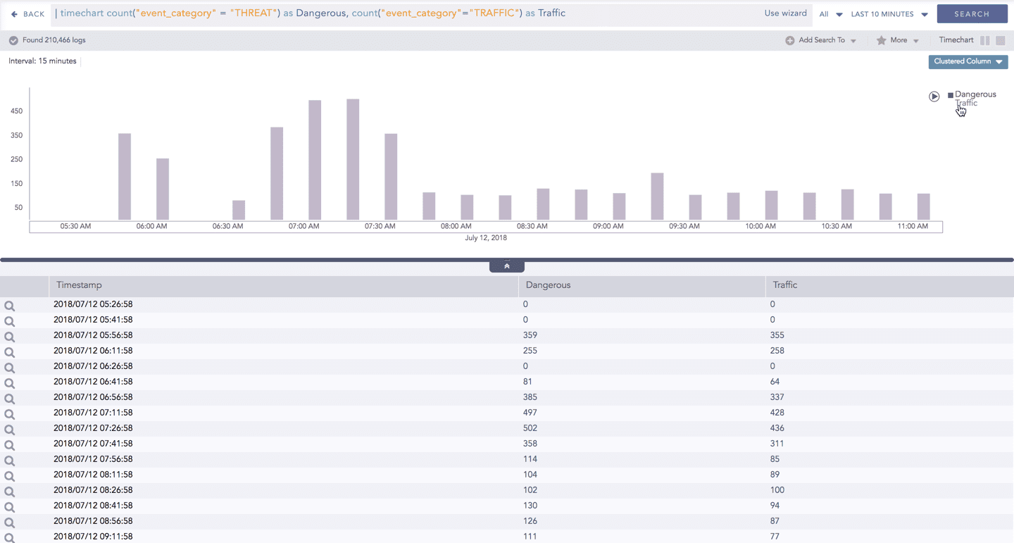
Timechart Single Aggregation without Grouping
The Timechart Single Aggregation without Grouping response type is used for aggregation of processed logs to a given aggregation parameter grouped into time buckets (as a time series data) over a specified time range.
The general syntax for the Timechart Single Aggregation without Grouping is:
Example queries of the Timechart Single Aggregation without Grouping type are:
This response type displays the value of the aggregation parameter in the specified range of time. The charts that are used to visualize the queries belonging to this response type are : Column, Line, Area, Day/Hour Heatmap, and Radar.
Visualization Type
Sample Search Query
Additionally, the Cumulative chart option is also available along with the Normal chart for the Column, Line, and Area charts. The Cumulative option visualizes the results by accumulating data from the starting point to the current time-bucket for all time-buckets whereas the normal option visualizes the results as obtained from the query.
General Operations for Timechart Single Aggregation without Grouping
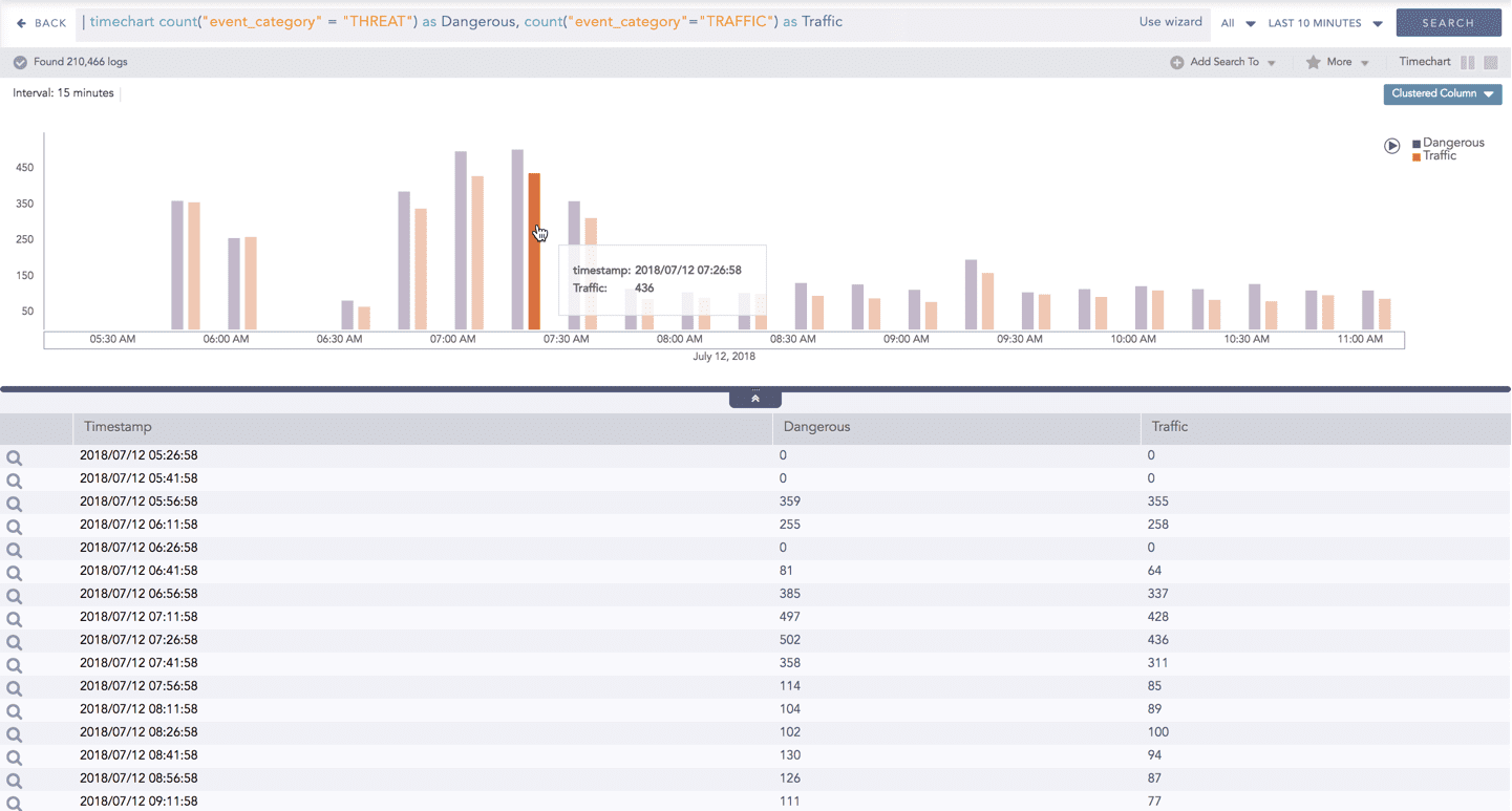
Drill-down
You can choose to view a detailed search for the response type regarding a specific value in two ways, i.e., from the line, or using a drag box.
Hover over a specific component/area of a chart to view a tool-tip. The tooltip displays all the information about the particular node.
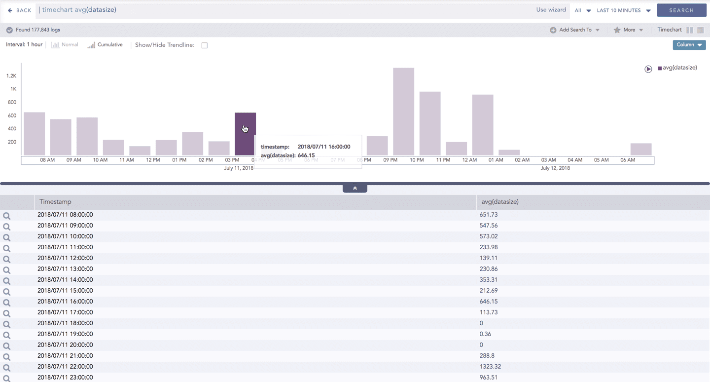
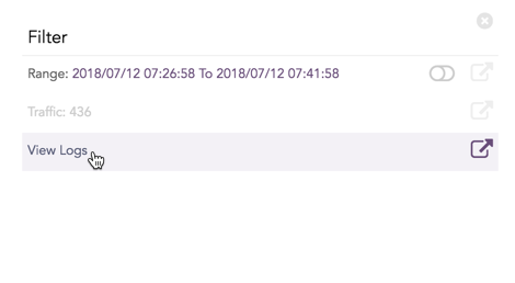
Click the component to open a drill-down window. The window summarizes the related information of the selected section along with the option to drill down as per your preference.
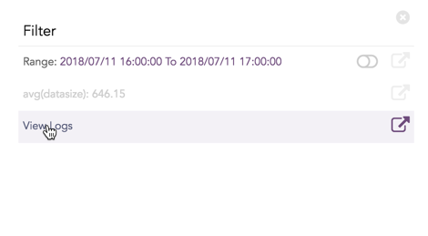
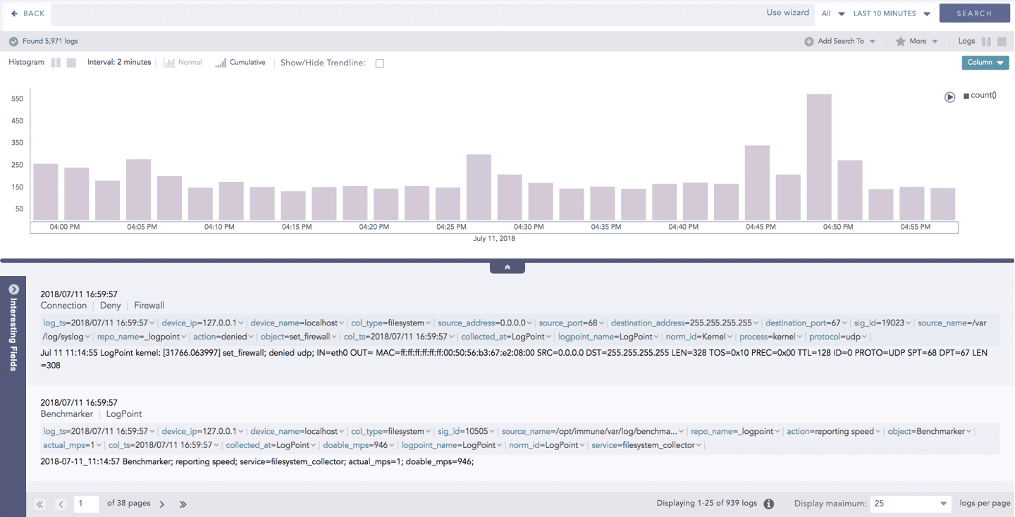
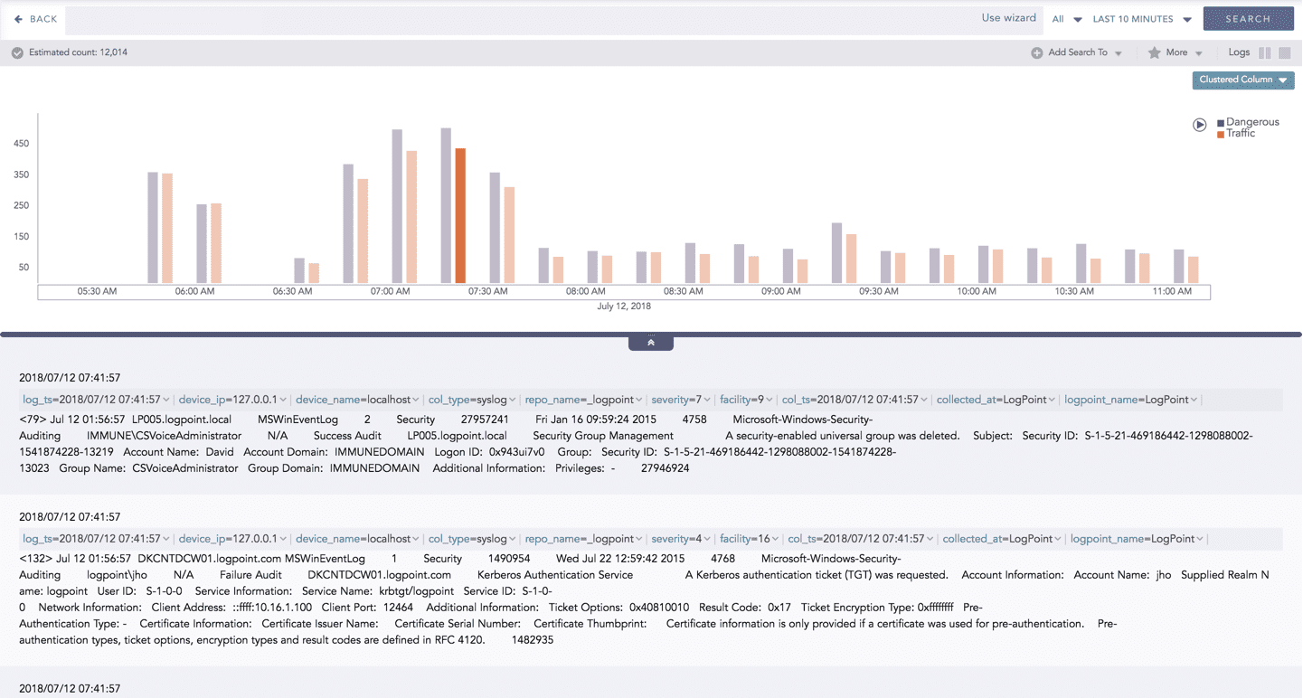
Click the corresponding Open in a new window icon to further drill-down the search result from any field. Additionally, click the View Logs to view the search result for the selected set of data.
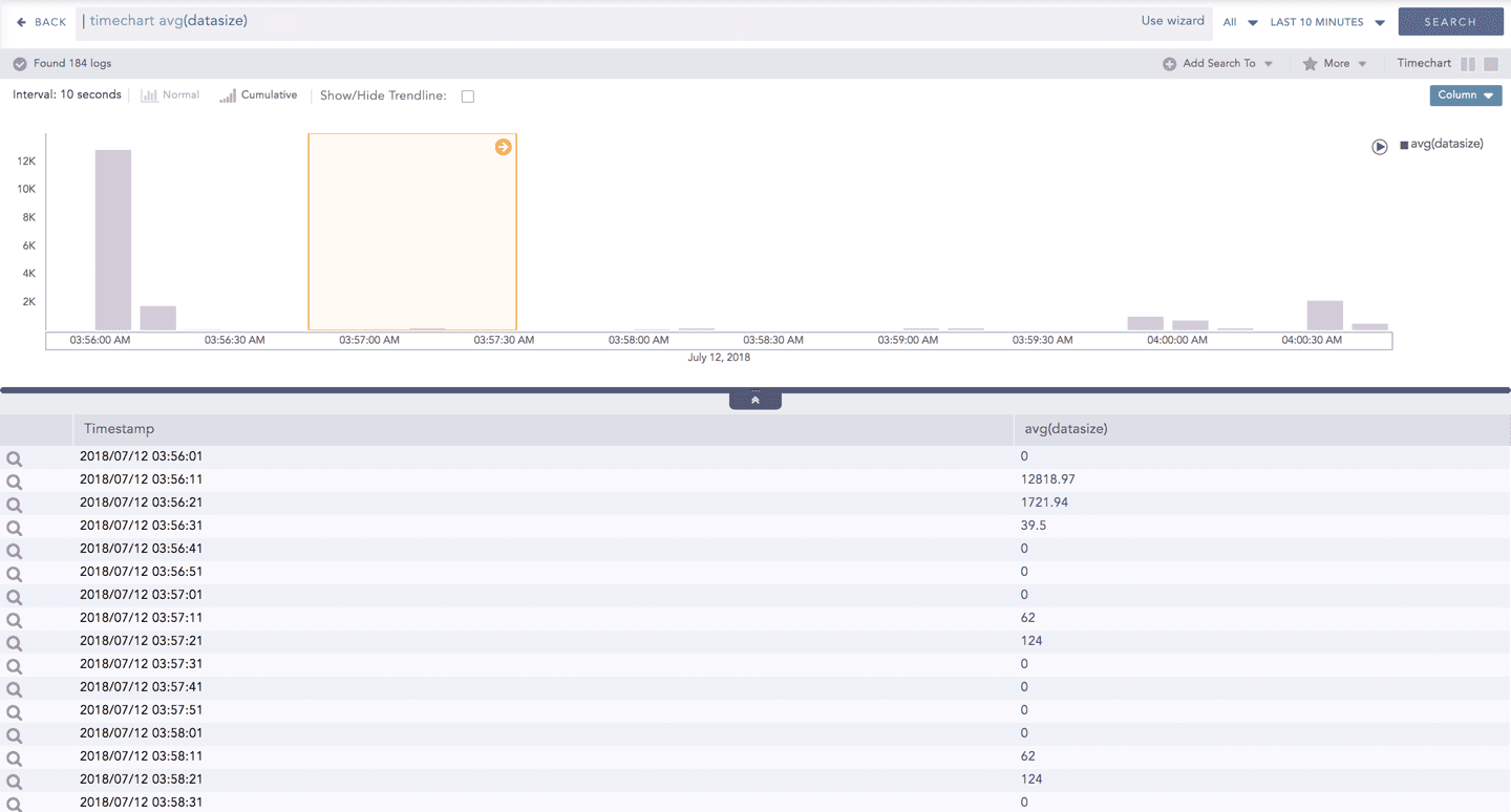
In addition to that, you can also drill down any chart of the response type using the drag box. Click and drag the mouse inside the graph, a yellow colored transparent drag box appears. You can drill-down the selected section of the chart by clicking the drill-down icon on the top-right corner of the box. You can resize or move the drag box as per your requirement.
The Cumulative chart displays the accumulated data values throughout the given time range. To view the cumulative chart, click Cumulative on the left side of the container of a chart.
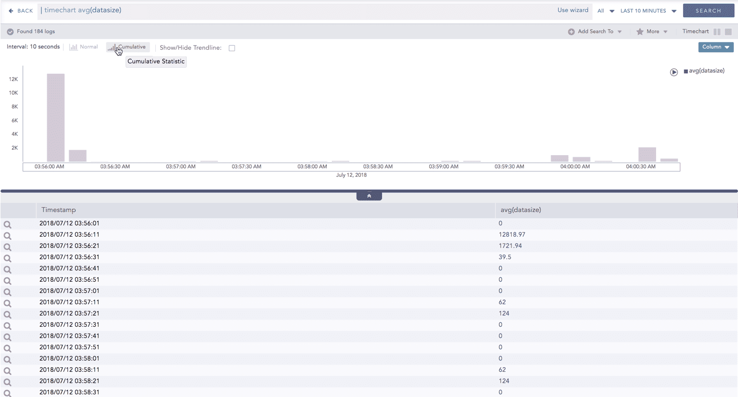
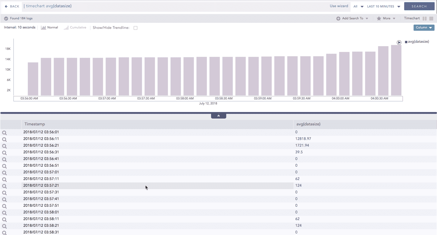
Click Normal to view the regular chart.
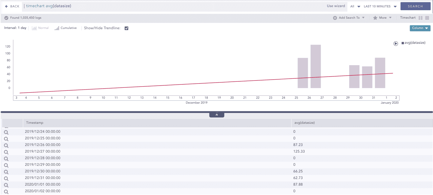
Trendline
You can select the Show/Hide Trendline checkbox to identify whether the time-series data is likely to increase, decrease, or remain constant over a time period. The data on an increasing trend forms an upsloping line, whereas, on a decreasing trend, it forms a downsloping line. The Show/Hide Trendline checkbox is available for Column, Line, and Area charts of this response type only.
The Show/Hide Trendline checkbox is also available for Column, Line, and Area charts resulted from Simple search queries and a blank search query.
Interactive Animation
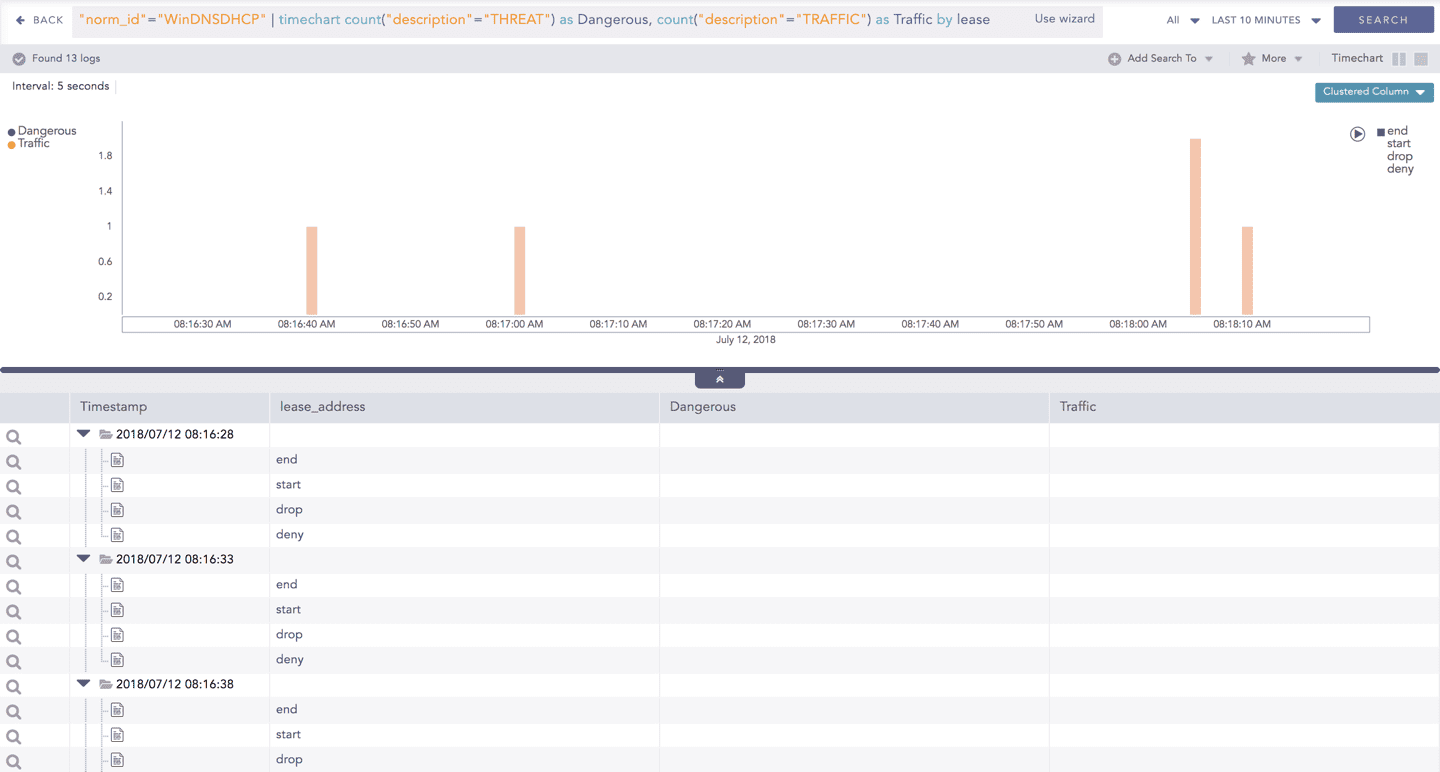
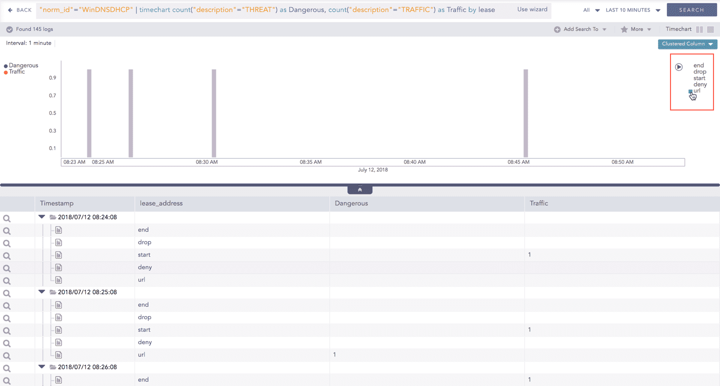
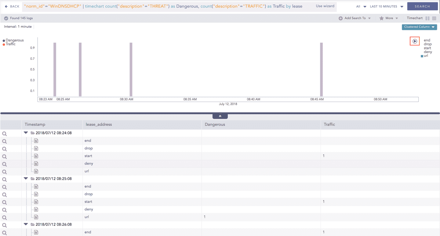
The charts belonging to the Timechart response type include an interactive play button. The button allows you to slide through values of the charts concerning time buckets known as Interval.
Click Play on the right side of the container to start the animation. The graph is refreshed every four seconds, i.e., that graph shifts from one time-bucket to another time bucket every four seconds. Value of the time bucket is dependent upon the time-range specified in the Interval.
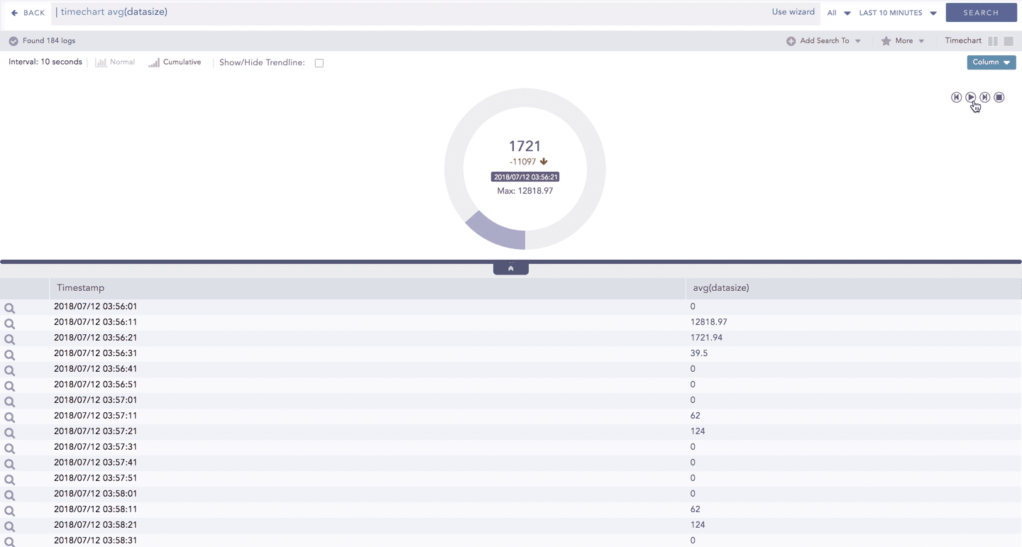
You can also click Pause, Stop, Previous, Next, Replay as required.
The operations Cumulative chart and Interactive Animation are not available for the Radar chart.
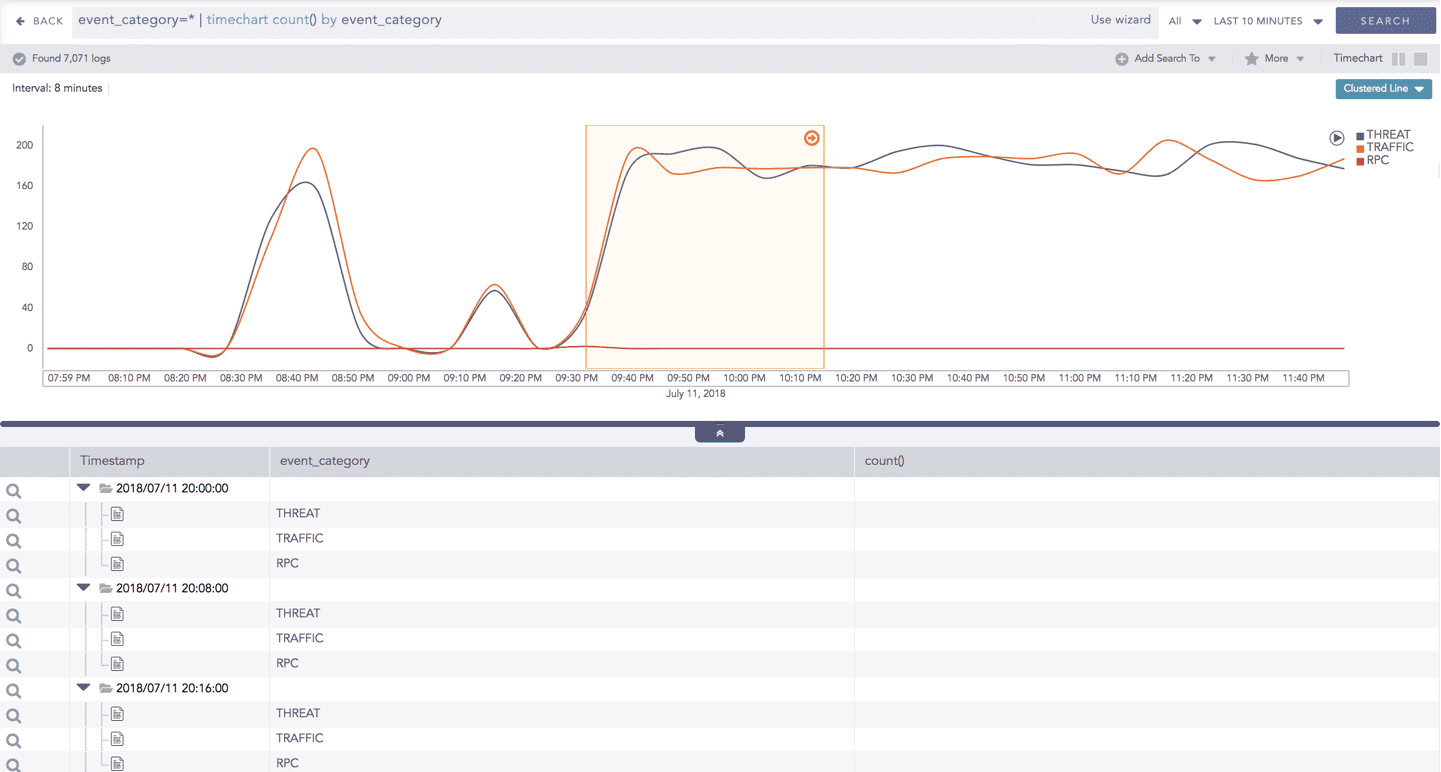
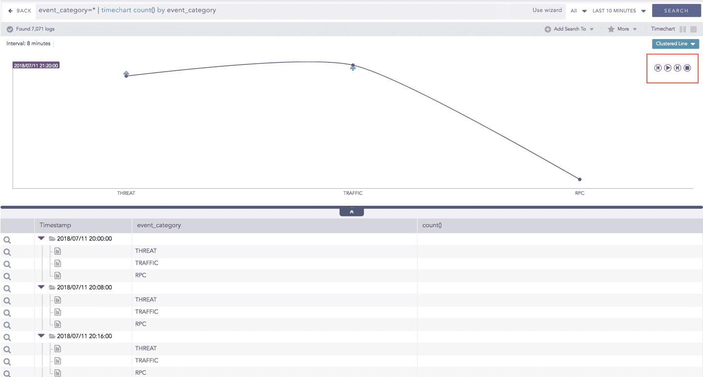
Timechart Single Aggregation with Grouping
The Timechart Single Aggregation with Grouping response type is used for aggregation of processed logs by an individual grouping parameter concerning given a single aggregation parameter grouped into time buckets (as a time series data) over a specified time range.
The general syntax for Timechart Single Aggregation with Grouping is:
Example queries of Timechart Single Aggregation with Grouping type are:
This query displays the count of the logs generated by the individual action, for an individual time bucket over a specified range of time. The result of this query can be represented in the form of :
General Operations for Timechart Single Aggregation with Grouping
This section contains the general operations that can be applied to all the charts belonging to the Timechart Single Aggregation with Grouping response type.
Some charts might consist of operations that are relevant to the specific chart only. In this case, refer to the section of the particular chart.
Interactive Legend
In the Timechart Single Aggregation with Grouping response type, when a chart is rendered, all the aggregation values of the selected grouping parameter(s) are displayed with a unique color for each value of the grouping parameter(s). However, you can choose to view the graphs concerning a specific value of grouping parameter(s).
To hide the value of a grouping parameter, click the name of the parameter on the legend at the extreme right side of the container.
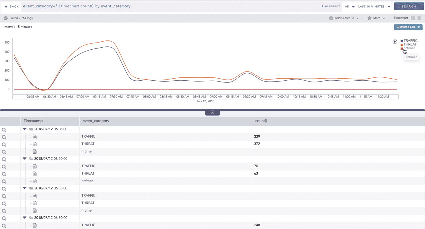
When you click a name of a parameter on the legend, the section (line, bar) referring to the respective parameter disappears, and a new chart is rendered consisting all other values of the grouping parameter(s). Click the legend again to unhide the particular value.
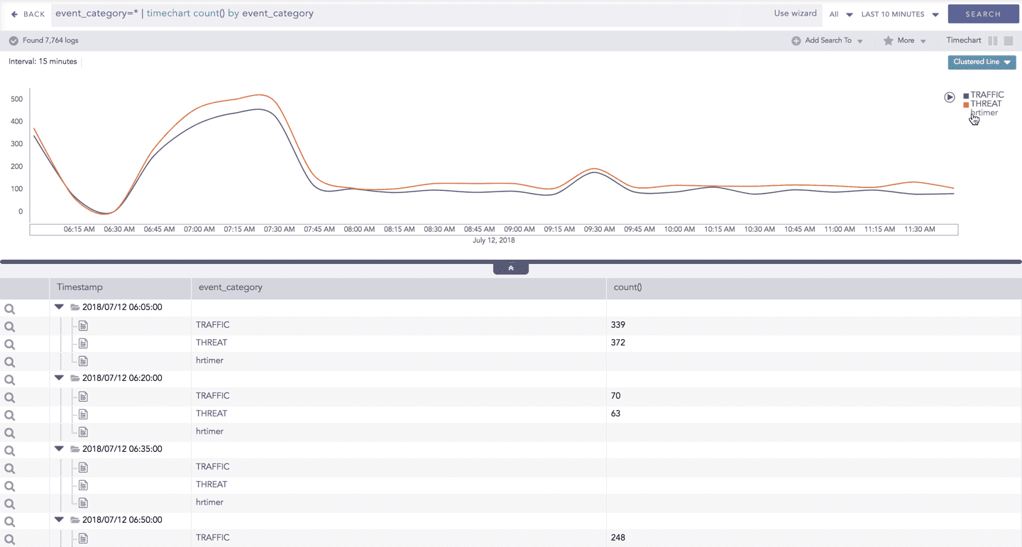
The scale on the y-axis is auto-adjusted as per the value of the remaining values of grouping parameter(s)
Drill-down
You can choose to view a detailed search for the response type regarding a specific value in two ways, i.e., from the line, or using a drag box.
Hover over a specific component/area of a chart to view a tool-tip. The tooltip displays all the information about the particular node.
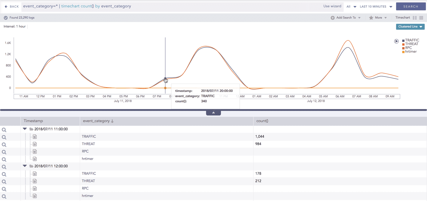
Click the component to open a drill-down window. The window summarizes the related information of the selected section along with the option to drill down as per your preference.
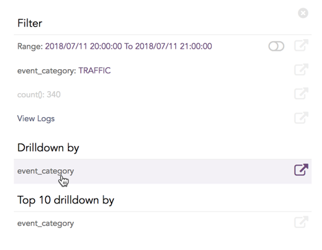
Click the corresponding Open in a new window icon to further drill-down the search result from any field. Additionally, click the View Logs to view the search result for the selected set of data.
In addition to that, you can also drill-down any chart of the response type using the drag box. Click and drag the mouse inside the graph, a yellow colored transparent drag box appears. You can drill-down the selected section of the chart by clicking the drill-down icon on the top-right corner of the box. You can resize or move the drag box as per your requirement.
Interactive Animation
The charts belonging to the Timechart response type include an interactive Play button. It allows you to slide through values of the charts concerning time buckets known as Interval.
Click the Play on the right side of the container to start the animation. The graph is refreshed every four seconds, i.e., that graph shifts from one time-bucket to another time bucket every four seconds. Value of the time bucket is dependent upon the time-range specified in the Interval.
You can also click Pause, Stop, Previous, Next, Replay as required.
Timechart Multiple Aggregation without Grouping
The Timechart Multiple Aggregation without Grouping response type is used for aggregation of processed logs related to the given parameters. The logs are grouped into time buckets (as a time series data) over a specified time-range.
The general syntax for Timechart Multiple Aggregation without Grouping is:
Example queries of Timechart Multiple Aggregation without Grouping type are:
This query displays the count of total logs generated and the average datasize of collected logs for individual time bucket over a specified range of time. The result of this query can be represented in the form of :Clustered Column, Clustered Line, Radar, and Stacked Area charts.
Visualization Type
Sample Search Query
General Operations of Timechart Multiple Aggregation without Grouping
This section contains the general operations that can be applied to all the charts belonging to the Timechart Multiple Aggregation without Grouping response type.
Some charts might consist of operations that are relevant to the specific chart only. For such operations, refer to the section of the particular chart.
Interactive Legend
In the Timechart Multiple Aggregation without Grouping response type, when a chart is rendered, all the values of the selected aggregation parameter(s) are displayed with a unique color for each value of the aggregation parameter(s). However, you can view the graphs for specific aggregation parameter(s).
To hide an aggregation parameter, click the name of the parameter on the legend at the extreme right side of the container.
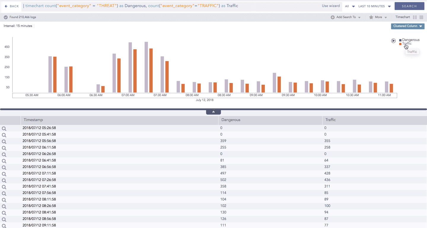
When you click a name of a parameter on the legend, the section (line, column, bar) referring to the respective parameter disappears, and a new chart is rendered consisting all other aggregation parameters (s). Click the legend again to unhide the value.
The scale on the y-axis is auto-adjusted as per the value of the remaining aggregation parameter(s).
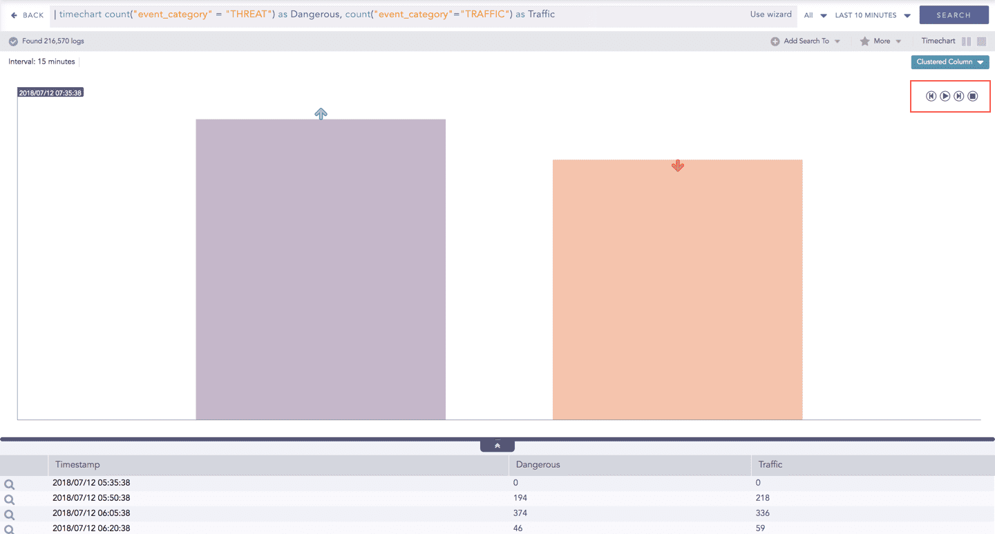
Drill-down
You can choose to view a detailed search for the response type regarding a specific value in two ways, i.e., from the line, or using a drag box.
Hover over a specific component/area of a chart to view a tool-tip. The tooltip displays all the information about the particular node.
Click the component to open a drill-down window. The window summarizes the related information of the selected section along with the option to drill down as per your preference.
Click the corresponding Open in a new window icon to further drill-down the search result from any field. Additionally, click the View Logs to view the search result for the selected set of data.
In addition to that, you can also drill-down any chart of the response type using the drag box. Click and drag the mouse inside the graph, a yellow colored transparent drag box appears. You can drill-down the selected section of the chart by clicking the drill-down icon at the top-right corner of the box. You can resize or move the drag box as per your requirement.
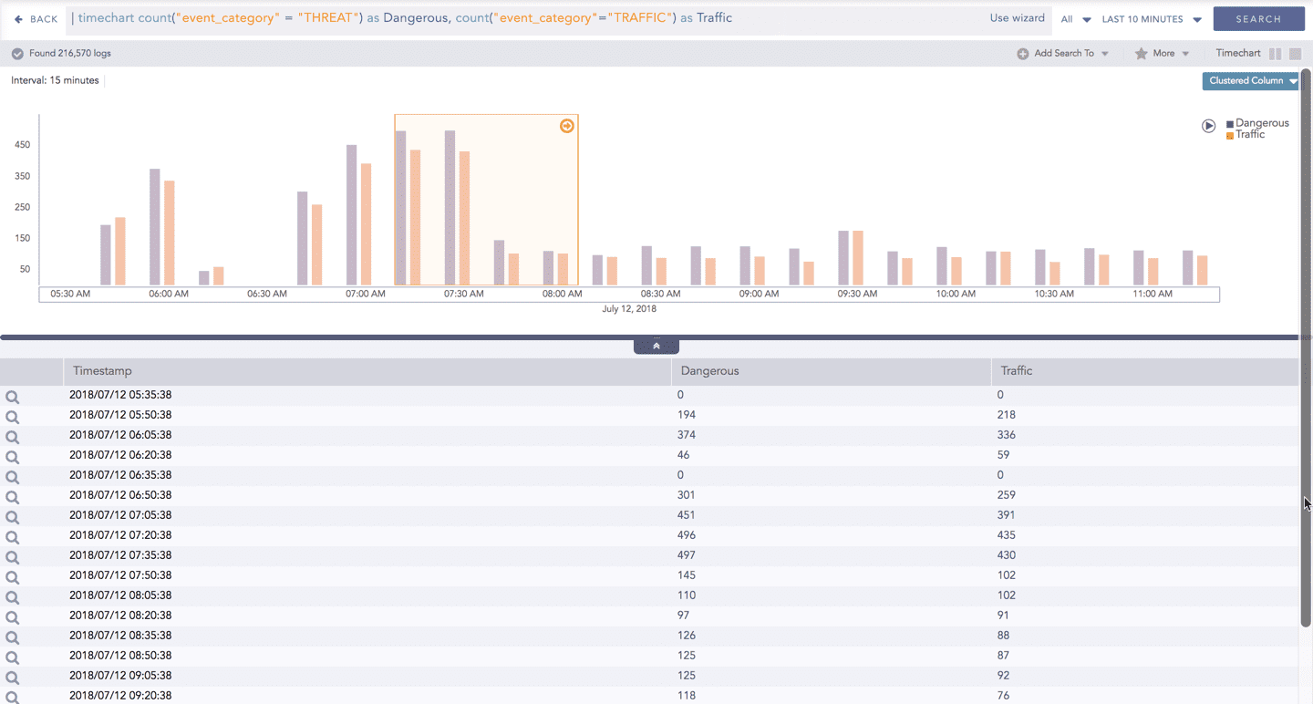
The charts belonging to the Timechart response type include an interactive play button. It allows you to slide through values of the charts concerning time buckets known as Interval.
Click Play on the right side of the container to start the animation. The graph is refreshed every four seconds, i.e., that graph shifts from one time-bucket to another time bucket every four seconds. Value of the time bucket is dependent upon the time-range specified in the Interval. You can also click Pause, Stop, Previous, Next, Replay as required.
Timechart Multiple Aggregation with Grouping
The Timechart Multiple Aggregation with Grouping response type is used for aggregation of an individual grouping parameter for given multiple aggregation parameters grouped into time buckets over a specified time range.
The general syntax for Timechart Multiple Aggregation without Grouping is:
An example of a search query for the response is:

The result of this query can be represented in the form of : Clustered Column and Bubble charts.
General operations for Timechart Multiple Aggregation with Grouping
Drill-down
Like in the search results of other responses, when you hover on any section (here, any count() or avg(doable_mps)), the selected section is highlighted, and the information for the selected section is as shown in the tooltip.
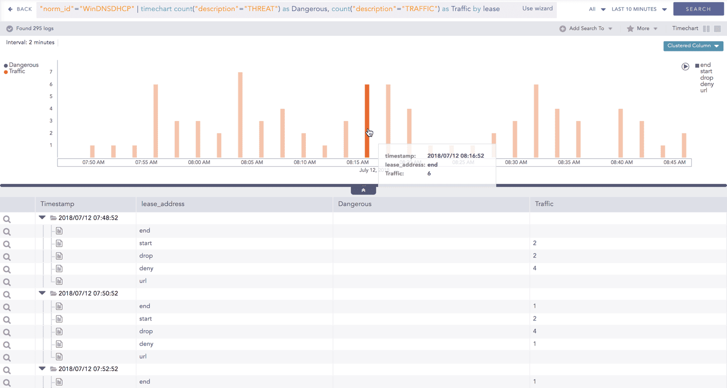
Click the component to open a drill-down window. The window summarizes the related information of the selected section along with the option to drill down as per your preference.
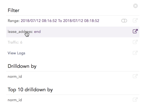
Click the corresponding Open in a new window icon to further drill-down the search result from any field. Additionally, click the View Logs to view the search result for the selected set of data.
In addition to that, you can also drill-down any chart of the response type using the drag box. Click and drag the mouse inside the graph, a yellow colored transparent drag box appears. You can drill-down the selected section of the chart by clicking the drill-down icon on the top-right corner of the box. You can resize or move the drag box as per your requirement.
Interactive Legend
For the responses of Timechart Multiple Aggregation with Grouping, the legend is displayed on either side of the search graph. The aggregation parameter(s) is shown on the left-hand side whereas the grouping parameter is shown on the right-hand side.
An important thing to note here is that at an instant, the result of only one of the grouping parameters is displayed. Moreover, only the legends of the grouping parameter (on the right) are interactive. The legends of aggregation parameters (on the left) are not interactive.
Interactive Animation
The charts belonging to the Timechart response type include an interactive Play button. It allows you to slide through values of the charts concerning time buckets known as Interval.
Click the Play on the right side of the container to start the animation. The graph is refreshed every four seconds, i.e., the graph shifts from one time bucket to another time bucket every four seconds. The value of the time bucket depends on the time range specified in the Interval.
You can also click Pause, Stop, Previous, Next, and Replay as required.
Charts
Charts visualize search results in different formats to help you analyze trends, distributions, and relationships in logs. Each chart type presents data in a specific way, making it easier to identify patterns, compare values, or monitor changes over time based on your analysis needs.
The following sections describe the available chart types in Logpoint and explain when and how to use each chart to effectively visualize search results.
Area Chart
The Area chart is used to represent quantitative data graphically. The graph is used to interpret the quantitative statistics graphically. The graph is based on a Line graph, and the area between the x-axis and lines is emphasized with colors, textures, or hatchings.
Area charts are used to represent accumulated totals using numbers and percentages. It is also used to show the trends over time, along with all related attributes.
The x-axis of the Area chart represents the grouping parameter(s), and the y-axis represents values of the aggregation parameter.
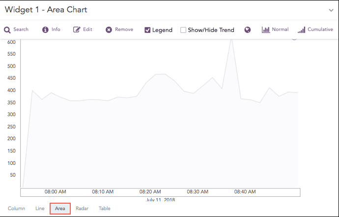
The following query gives the output shown above.
The Area chart supports two aggregation response types for the representation of search results in the visualization:
Single Aggregation with Grouping
Timechart Single Aggregation without Grouping
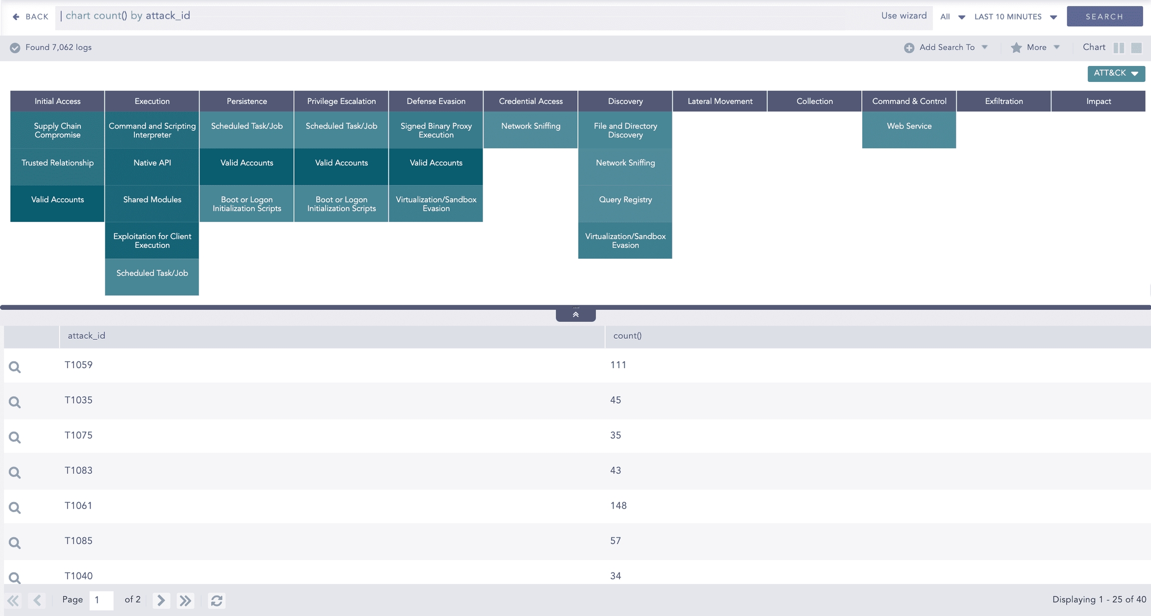
ATT&CK Chart
The ATT&CK chart is a heatmap describing the attacks carried out on a system in the form of attack tactics, techniques, and sub-techniques described by MITRE. You can select the ATT&CK chart from the search page only if you provide attack_id as a grouping parameter.
Logpoint adds the following fields to logs each time an alert is triggered:
attack_id: An ID for the attack.
attack_category: The type of attack tactic used.
attack_tag: The type of attack technique used.
The header row of the ATT&CK chart contains the tactics that may be used to perform an attack. The body of the chart displays the techniques used to execute the corresponding tactics.
The ATT&CK chart also displays a drop-down icon on some cells. You can select the icon to see the sub-techniques involved in the relevant attack technique. The color intensity for each cell is based on the frequency of the corresponding technique and sub-technique.
Example:
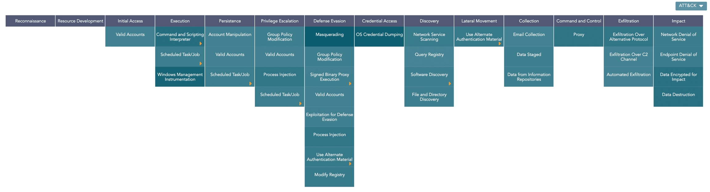
You can drill down on the ATT&CK chart by clicking on each tactic in the header row and each technique and sub-technique cell in the heatmap.
Grouping by Entities
Logpoint also allows further analysis of the ATT&CK chart across multiple entities. You can do this by grouping the results using the required entity. Logpoint currently supports grouping by the following entities:
user
ip_address
workstation
When grouped:
Clicking the icon displays a bar chart showing each entity's contribution to the overall results. Here, the y-axis represents the entities, and the x-axis represents the count of the entities in the overall results.
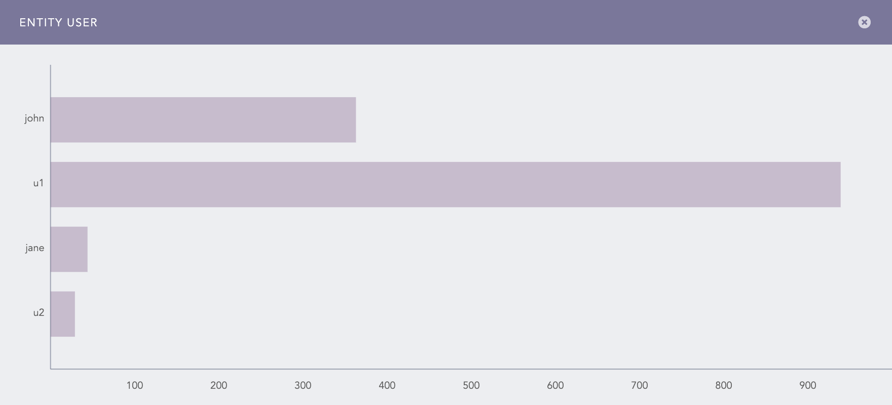
Contribution of user entities in the ATT&CK chart The Info icon is displayed while hovering on each cell of the ATT&CK chart. It displays a bar chart describing the contribution of the entities to the corresponding attack technique or sub-technique. Here, the x-axis represents the entities, and the y-axis represents the count of the entities in the results for the selected technique or sub-technique.
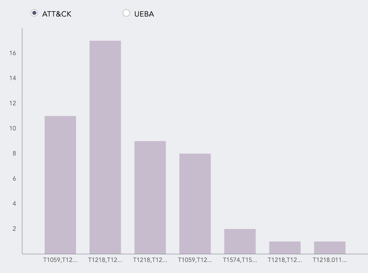
Contribution of user entities in the technique
The bar chart shows the data for the selected technique or sub-technique under all the attack tactics. To display the data for only the selected tactic, you must group the results by attack_category as well.
If you have enabled Logpoint UEBA, you can also view the risk scores for the entities by clicking UEBA. This chart displays only the entities that have a risk score of more than one.
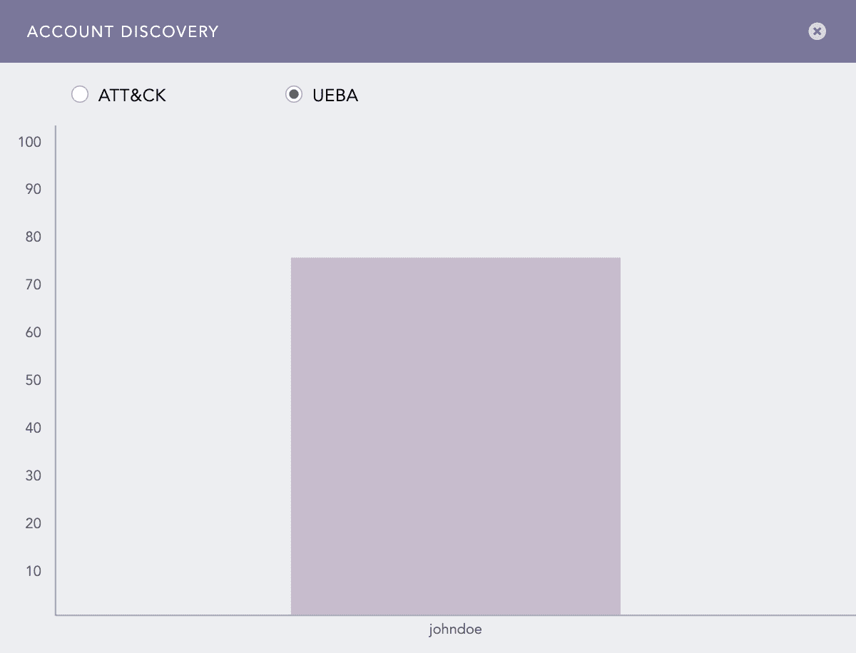
The entity and info icons are displayed only if you group the results by user, ip_address, or workstation fields. Therefore, if you have a field named differently in the search results, make sure to rename the field to one of the required names using the rename command.
If you group the results by multiple valid entities, the results are grouped only by one of the provided entities. In this case, LogPoint prioritizes the entities in the following order:
user
ip_address
workstation
You can drill down on each entity’s results by clicking the corresponding column of the entity bar charts. Additionally, you can drill down into the UEBA dashboard by clicking the risk score for each entity.
The entity icons are not displayed in the Search Templates and Dashboard.
The ATT&CK chart supports Single Aggregation with the Grouping response type to represent search results in the visualization.
Example:
Bar Chart
Bar chart visualizes categorical data as a rectangular bar with the width proportional to the value. The x-axis represents the aggregation parameter, and the y-axis represents the grouping parameter(s).
For example,
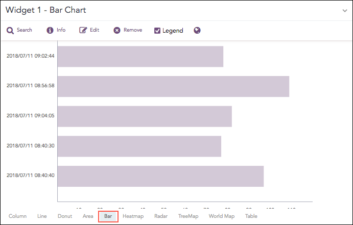
The Bar chart supports single aggregation with grouping.
Syntax:
Bubble Chart
The Bubble Chart is a scatter chart that shows the relationship between variables using three dimensions: the x-axis, the y-axis, and the bubble radius. The chart can display different groups of data at once. Based on the grouping parameter, the chart groups the data into bubbles of different colors with each color representing a single group.
You can see the group names and their corresponding colors in the legend to the right of the chart.
Example:
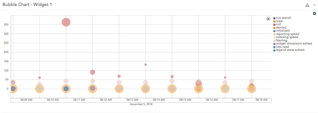
The Bubble chart supports:
Multiple Aggregation with Grouping
Example:
Timechart Multiple Aggregation with Grouping
Example:
Change the position of the plots.
Click the Settings icon at the top right.
Select the Y-axis and Plot in Radius.
Click Submit.
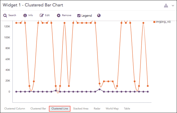
Clustered Bar Chart
The Clustered Bar chart is a horizontal bar graph that represents multiple categorical data in a rectangular bar with the width proportional to the value. The only difference between a Clustered Bar chart and a Clustered Column Chart is the placement of parameters. In a Clustered Column Chart, the aggregation parameter is placed on the x-axis whereas, in a Clustered Bar chart, the parameters are placed in the y-axis.
Syntax:
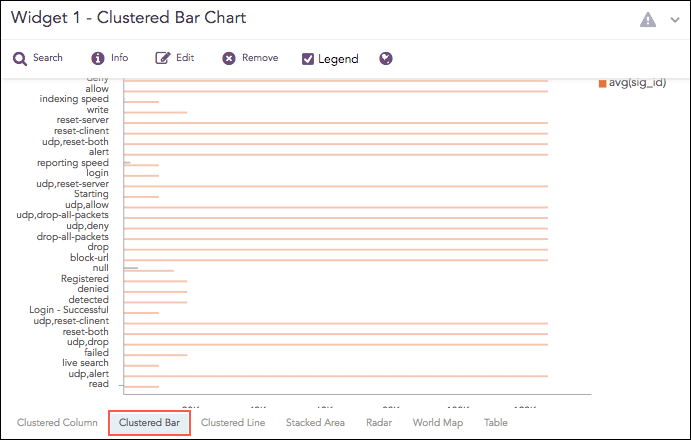
The Clustered Bar chart supports:
Multiple Aggregation without Grouping
Syntax Example:
Multiple Aggregation with Grouping
Syntax Example:
Clustered Column Chart
The Clustered Column chart allows you to display multiple quantitative variables. Unlike a standard Column Chart, where only one variable is used to mark x-axis, a Clustered Column chart uses multiple variables on the x-axis with a different color for each variable.
Syntax:
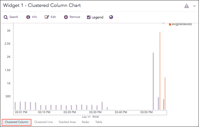
The Clustered Column chart supports:
Multiple Aggregation without Grouping
Syntax Example:
Multiple Aggregation with Grouping
Syntax Example:
Timechart Multiple Aggregation without Grouping
Timechart Multiple Aggregation with Grouping
Clustered Line Chart
The Clustered Line chart is an extension of the Line Chart in which multiple lines are used to represent values of different categories. Similar to the Clustered Column Chart, in a Clustered Line chart, the x-axis contains the values of the grouping parameters, and the y-axis contains the scale to measure the value of an aggregation parameter of the particular grouping parameter.
Syntax:
The Clustered Line chart supports:
Multiple Aggregation with Grouping Syntax Example:
Timechart Single Aggregation with Grouping
Syntax Example:
Timechart Multiple Aggregation without Grouping
Column Chart
The Column Chart is a vertical bar graph that represents categorical data in rectangular bars with heights proportional to the values that they represent.
The Column Chart shows comparisons among discrete categories. It is a two-dimensional graph in which one axis of the graph shows the specific groups being compared, and another one represents the measured value.
Syntax:
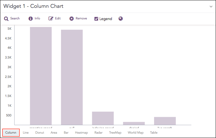
The Column chart supports:
Single Aggregation with Grouping Syntax Example:
Timechart Single Aggregation without Grouping
Syntax Example:
Day/Hour Heatmap Chart
Heatmaps visualize individual values in a matrix using different shades of a single color.
The Day/Hour Heatmap is an extension of a regular heatmap in which results are displayed in the day/hour format. It has seven rows and 24 columns. Each row represents a day of the week and each column represents an hour of the day. Therefore, each cell represents a single hour of a particular day.
The query format for the Day/Hour Heatmap is:
Example:
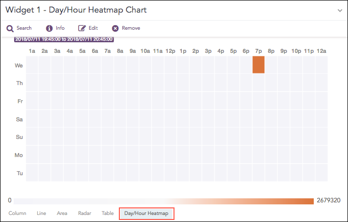
The Day/Hour Heatmap chart supports:
Timechart Single Aggregation without Grouping Syntax Example:
To change color coding:
Click the Settings icon.
In Rendering Parameters, change Positive Value and Negative Value color selections.
Click Submit.
Display Chart
Shows value(s) of aggregation parameter(s) in a container.
To view the search results in display format, select Display from the drop-down at the top-right corner of the Search Result page.
Syntax Examples:
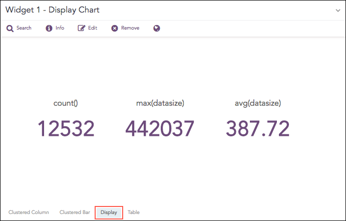
The Display chart supports:
Single Aggregation without Grouping
Single Aggregation with Grouping
Multiple Aggregation without Grouping
To change color coding and X-axis or output format:
Click Settings.
Use Output format (font/text formatting).
Use the text field to add/switch parameters or use Jinja syntax to format output.
Change Background color.
Click Submit.
Donut Chart
The Donut Chart shows the data distribution based on the length of its arc. It was introduced in LogPoint to replace the Pie Chart. The reason for this is that pie charts can be hard to interpret as they focus on the proportional areas of the slices. Donut charts de-emphasize the use of area and focus on the lengths of the arcs of each individual element
Syntax:
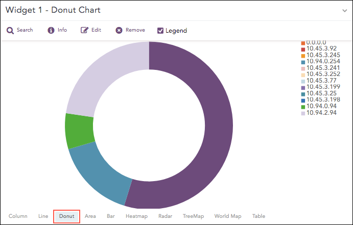
From Logpoint v5.5.0, the Pie chart has been replaced with the Donut chart. The Donut charts automatically replace any Pie charts created in earlier versions of LogPoint.
The Donut chart supports:
Single Aggregation with Grouping
Gauge Chart
Gauge chart, also known as speedometer chart, uses a single needle to show the information as a reading on a dial. The graph is used to visualize percentage values as well as a fixed range of data.
Syntax:
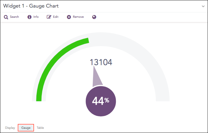
The value of the aggregation parameter determines the value pointed by the needle. You can configure the maximum value of the dial from Max value while rendering parameters. When a value of the aggregation parameter is equal to, or greater than the Max value, the percentage value of the needle is displayed as 100%.
Three different colors, green, yellow, and red are used to represent the limits for the data being depicted in the gauge. By default, the green, yellow, and red colors represent the low, mid, and high range of values respectively. However, you can configure the threshold value (in percentage) to display the dial in the yellow and red colors.
The value of Red starts is 90%, and the value of Yellow starts is 70% by default.
The Gauge chart supports Single Aggregation without Grouping.
Change thresholds and colors:
Click Settings.
Adjust Max value, Red Starts, Yellow Starts.
Click Submit.
Heatmap Chart
Heatmap visualizes individual values in a matrix and represents them through different color shades based on their intensity. Use it to analyze the differences across multiple variables, reveal patterns, and detect correlations between them.
Syntax:
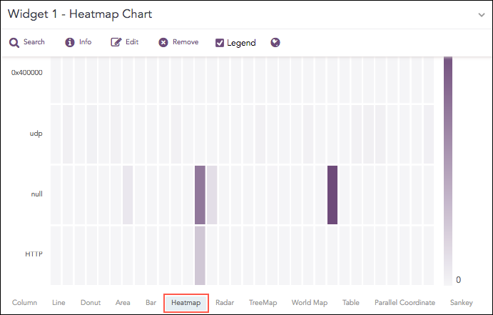
The Gauge chart supports:
Single Aggregation with Grouping. Syntax Example:
To change the X-axis or colors:
Click Settings.
Set X-Axis (select grouping parameter). Other grouping parameters go to the Y-axis.
Adjust Positive Value / Negative Value colors.
Click Submit.
Line Chart
The Line chart displays information as a series of data points called markers. The markers are connected to each other by a line.
The Line chart consists of two axes, in which x-axis contains the value of the grouping parameter(s) and the y-axis contains the values of the aggregation parameter. It is similar to a Column chart, except that, a Column chart usually displays discrete values, whereas a line chart visualizes a trend in continuous data.
Syntax:
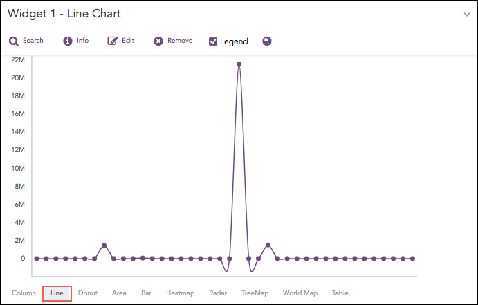
The Line chart supports:
Single Aggregation with Grouping. Syntax Example:
Timechart Single Aggregation without Grouping
Syntax Example:
Parallel Coordinate Chart
The Parallel Coordinate Chart is a visualization technique used to plot individual data elements across multiple dimensions. The charts are ideal for comparing many grouping parameters and analyzing the relationships between them. Each grouping parameter has its axis, and all the axes are placed in parallel to each other. Values are plotted as a series of lines that are connected across all the axes. This means that each line is a collection of points placed on each axis, which have all been linked together.
The Parallel Coordinate chart shows both the forest and the tree. You can see the big picture in the patterns of the lines. You can highlight the individual lines to see the performance of a specific value of parameters. It is useful in the situations when the behavior of particular parameters may not be of concern, but a combination of those parameters may emphasize an abnormal pattern or relationship.
Syntax:
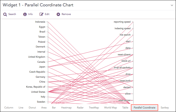
Each line represents a relationship between two parameters rather than a trend or change over time. When many values are displayed, the chart can become cluttered or overlapping, making it harder to interpret. In such cases, use the Brushing feature to highlight individual values or groups for better clarity.
You can also perform a combined drill-down using brushing. Select a range of values across multiple axes and click the brushed area to drill down into the corresponding data.
By default, the first grouping parameter in the query is assigned to the first axis of the Parallel Coordinate chart, followed by the remaining grouping parameters. You can change the order of parameters by dragging an axis to reposition it.
To view the aggregated value for a relationship, hover over its line.
The Parallel Coordinate chart supports:
Single Aggregation with Grouping. Syntax Example:
Radar Chart
The Radar chart is a graphical representation of multivariate data in the form of a two-dimensional graph, in which one or more quantitative variables are represented on axes starting from the same point.
Each value of grouping parameter(s) forms an individual axis which is arranged radially around a point. These axes are equiangular to each other and known as spoke or radii. Each node depicts the value of a spoke, and the lines are drawn to connect the nodes to each other.
The Radar chart is best for visualizing outliers in a dataset, especially in cases of operation related analysis such as performance metrics and quality improvement. The line between the origin points and radii can be used as the scale for data points.
Examples:
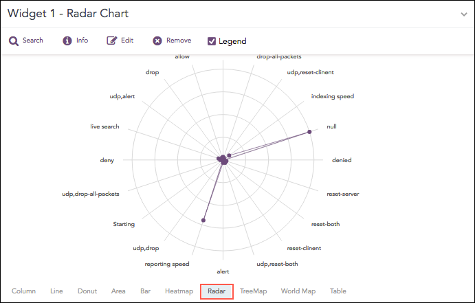
The Radar chart supports:
Single Aggregation with Grouping. Syntax Example:
Multiple Aggregation with Grouping Syntax Example:
Timechart Single Aggregation without Grouping Syntax Example:
Timechart Multiple Aggregation without Grouping Syntax Example:
Sankey Chart
Sankey chart is a flow diagram used to depict a flow from one set of values to another. The connected values are called nodes and the connections are called links. It displays the corresponding grouping parameters on top of each node of the chart. The width of the link shows the magnitude of the flow. Colors are used to divide the diagram into different nodes or to show the transition from one state of the process to another.
Use the Sankey chart to show a many-to-many mapping between two or more nodes. The aggregation parameter is used to define the width of the flow between a source node and a destination node.
Syntax:
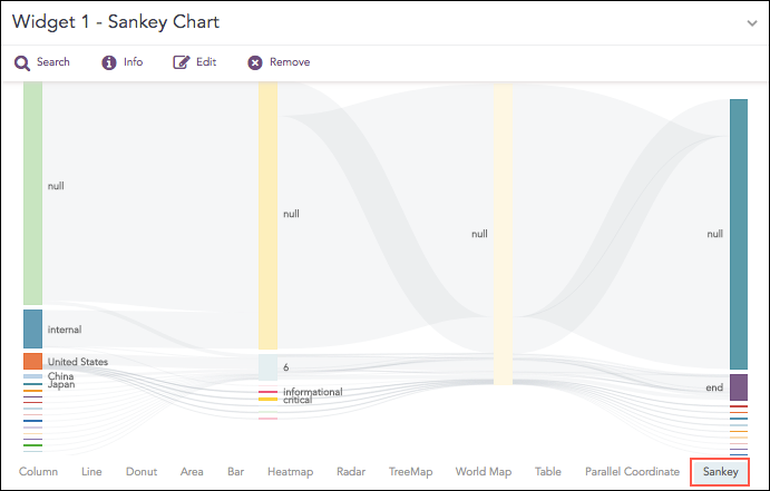
You can change the vertical position of nodes by dragging them up or down. Either overlap the nodes or place them distinctly. The Sankey chart supports:
Single Aggregation with Grouping. Syntax Example:
Stacked Area Chart
Stacked Area charts are fundamentally similar to a standard Area Chart, except for the use of multiple variables in the x-axis instead of a single variable.
Syntax:
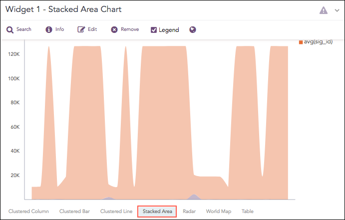
The Stacked Area chart supports:
Multiple Aggregation with Grouping. Syntax Example:
Timechart Multiple Aggregation without Grouping Syntax Example:
Stacked Column Chart
A Stacked Column chart uses bars to show the comparisons between categories of data, but with the ability to break down and compare parts of a whole. Each bar in the chart represents a whole, and segments in the bar represent different parts or categories of that whole.
Similar to the Clustered Line Chart, the y-axis represents the value of the aggregation parameter, and the x-axis displays the value of the timestamps.
Syntax:
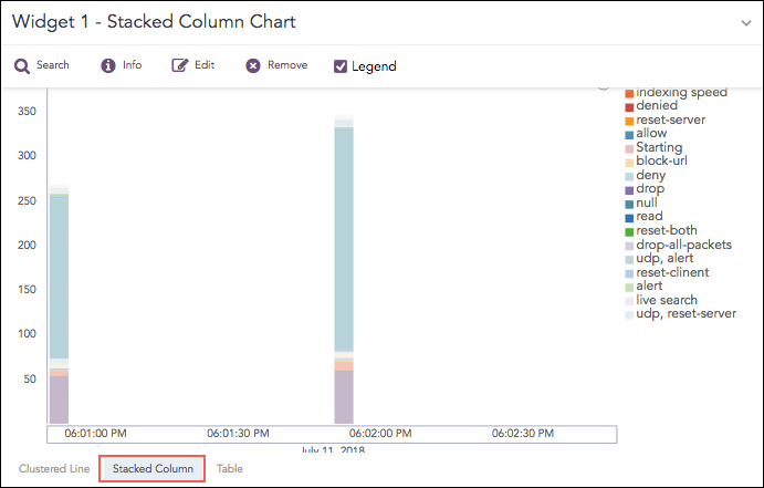
The Stacked Column chart supports:
Timechart Single Aggregation with Grouping. Syntax Example:
If the search result contains a large number of data points (more than 50) or groups (more than 20), switching from the Clustered Line to Stacked Column consumes a large amount of CPU resources. In this case, Logpoint displays the following message:

TreeMap Chart
The TreeMap chart visualizes the hierarchical structure of a tree diagram. It displays the weight of each node in the form of the area size. Each node is assigned a rectangular area with their child nodes nested inside. The space of each node inside a parent node is displayed with proportion to all other nodes within the same parent node. If the weight of a child node is zero, the node is not included in the diagram.
The chart also allows you to zoom in and zoom out. Zoom in lets you click a node in the chart to expand it and view the next level of data. When you zoom in, the chart displays the values of the next grouping parameter associated with the selected node. The selected node is added to the breadcrumb, and the chart updates to show the corresponding fields.
For example, clicking source_address 10.45.3.252 adds it to the breadcrumb and displays all related fields in the chart.
Use Zoom Out to return to the previous view by clicking the breadcrumb.
Syntax:
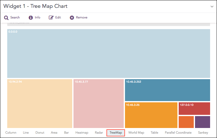
The first grouping parameter is the parent node of a TreeMap diagram, and all its successive parameters are the child nodes. The name of the first grouping parameter is displayed in the breadcrumb, while all its fields are displayed in the containers as individual nodes. The aggregation parameter determines the area size of each node in the container.
The TreeMap chart supports:
Single Aggregation with Grouping. Syntax Example:
Rendering Parameters
In the Treemap chart, click the gear icon on the right side of the breadcrumb.
In Rendering parameters, select a type:
Single
Unique
Gradient
If Single is selected, use the Color picker to choose the color used for all nodes.
If Unique is selected, all the nodes in the container are represented by a unique color. The colors are selected at random by Logpoint.
If Gradient is selected, set Color High to represent the node with the largest area and set Color Low to represent the node with the smallest area. In Gradient mode, each section has a defined color, and nodes are shown in different shades. The darkest shade indicates the largest area, and lighter shades indicate smaller areas.
World Map Chart
A World Map is a map of a country, a continent, or a region, with colors and values assigned to specific regions. Values are displayed as a color scale, and you can see the name of the country by hovering over a particular part.
The chart displays the value of the first grouping parameter only when the search query contains a single grouping parameter. When more grouping parameters are used, this value is not shown in the chart but can still be viewed in the Search Table.
Chart sections are clickable only when the search query includes two or three grouping parameters and the chart has a value for the aggregation parameter. As a result, you cannot drill down further for queries with only one grouping parameter or with more than three grouping parameters.
For search queries that include multiple aggregation parameters and two or three grouping parameters, you can view a Clustered Column chart by clicking any region on the World Map, provided the region has a value for the aggregation parameter.
You can also use pan and zoom to zoom in and out on a specific section of the world map and shift from one section to another.
Syntax:
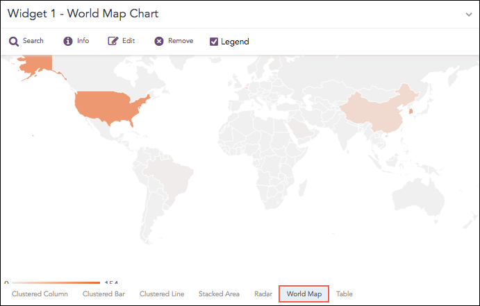
The World Map chart supports:
Single Aggregation with Grouping Syntax Example:
Multiple Aggregation with Grouping Syntax Example: Example:
Rendering Parameters
In the World Map chart, click the gear icon in the top-right corner to open the Rendering Parameters panel.
Use the available options to customize how data is displayed:
Country – Select the grouping parameter that contains country names.
Positive Value – Choose the color used to represent positive aggregation values.
Negative Value – Choose the color used to represent negative aggregation values.
These settings allow you to control how data appears on the map and make positive and negative values easier to distinguish.
Was this helpful?